Book Covers for Znak
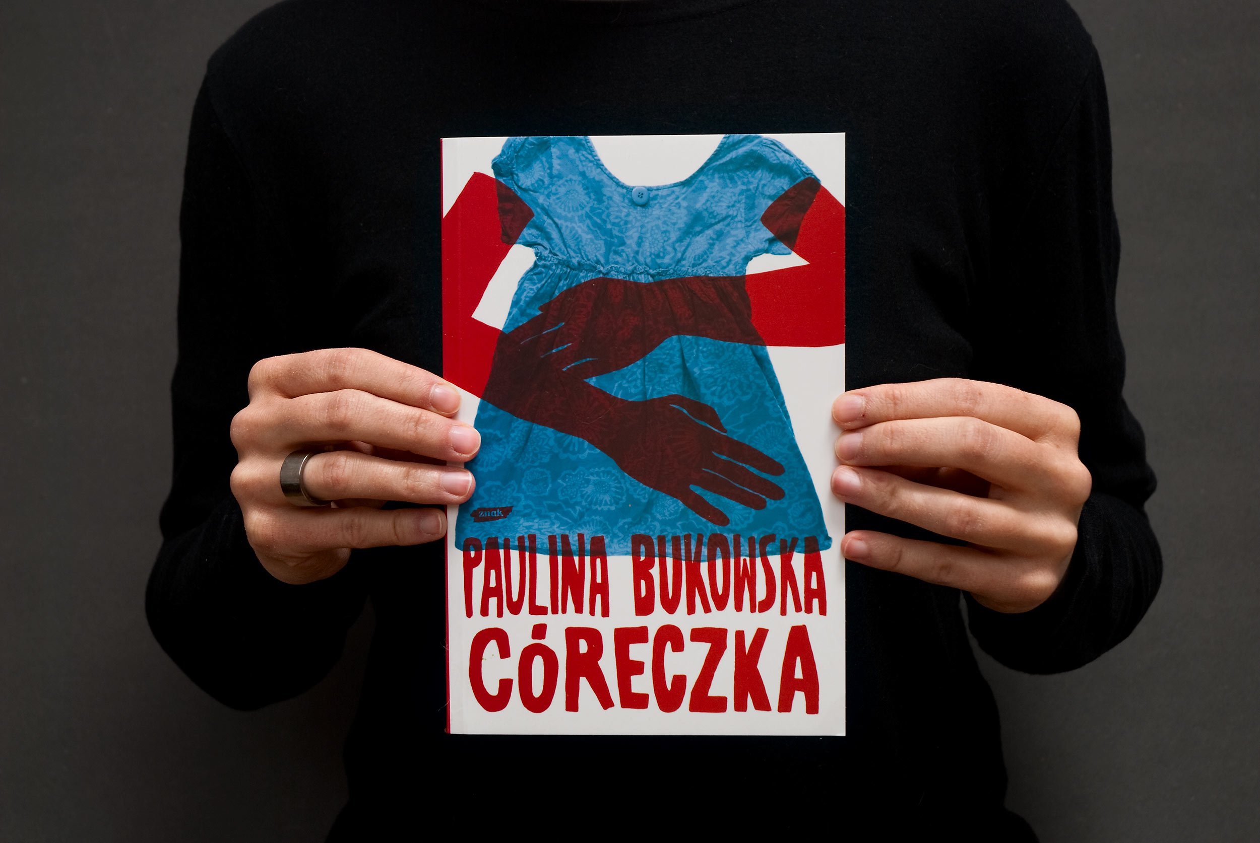
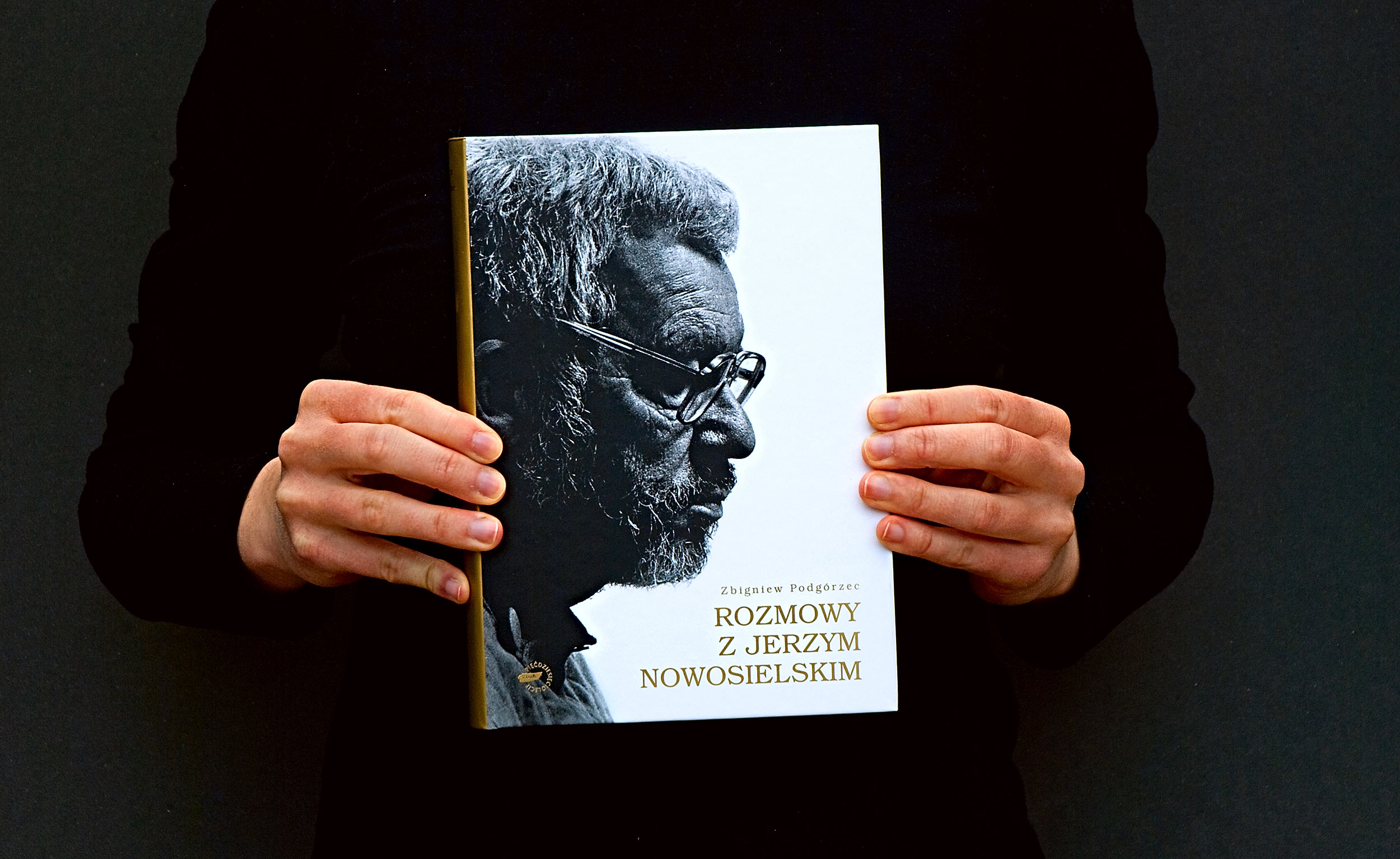
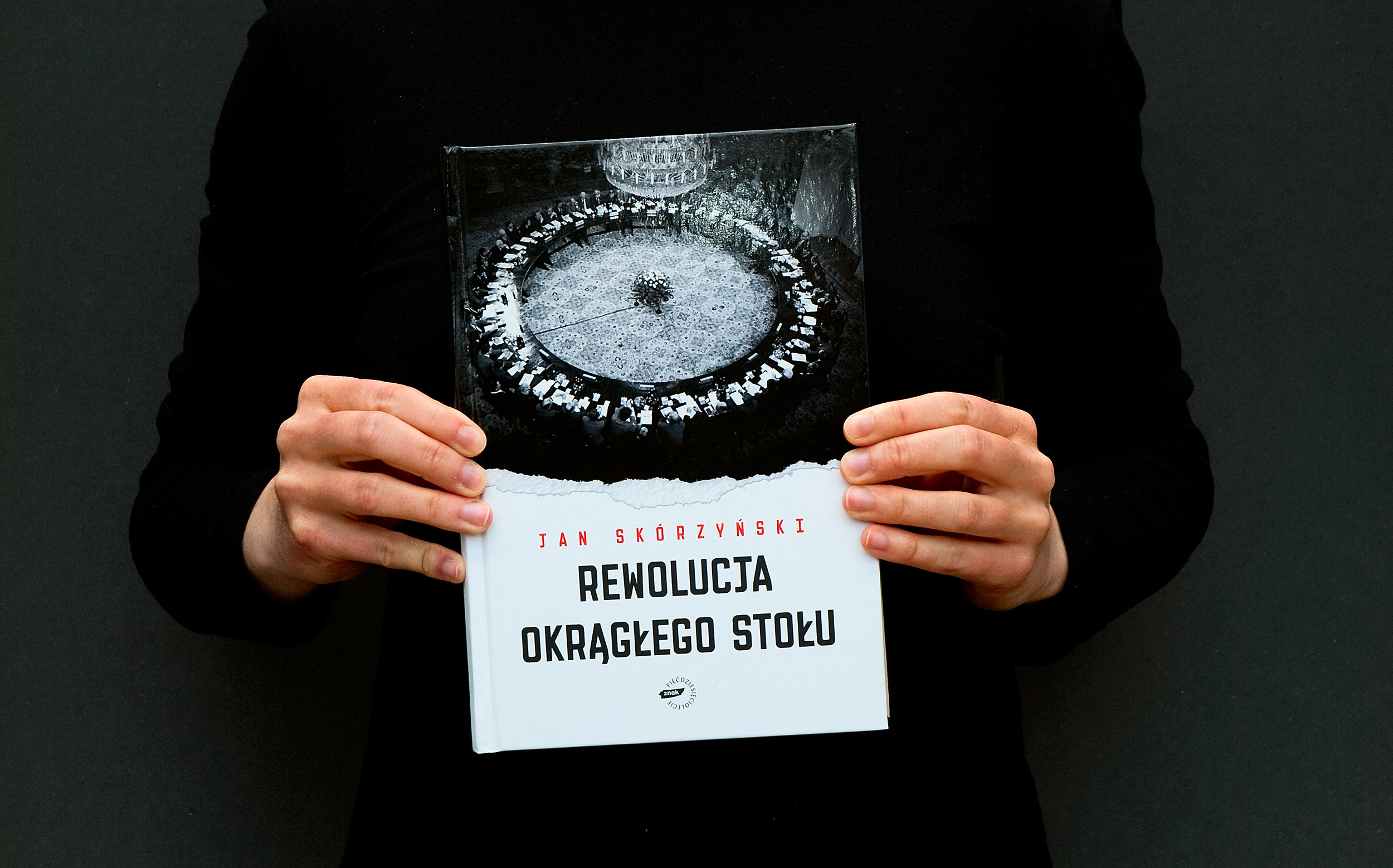
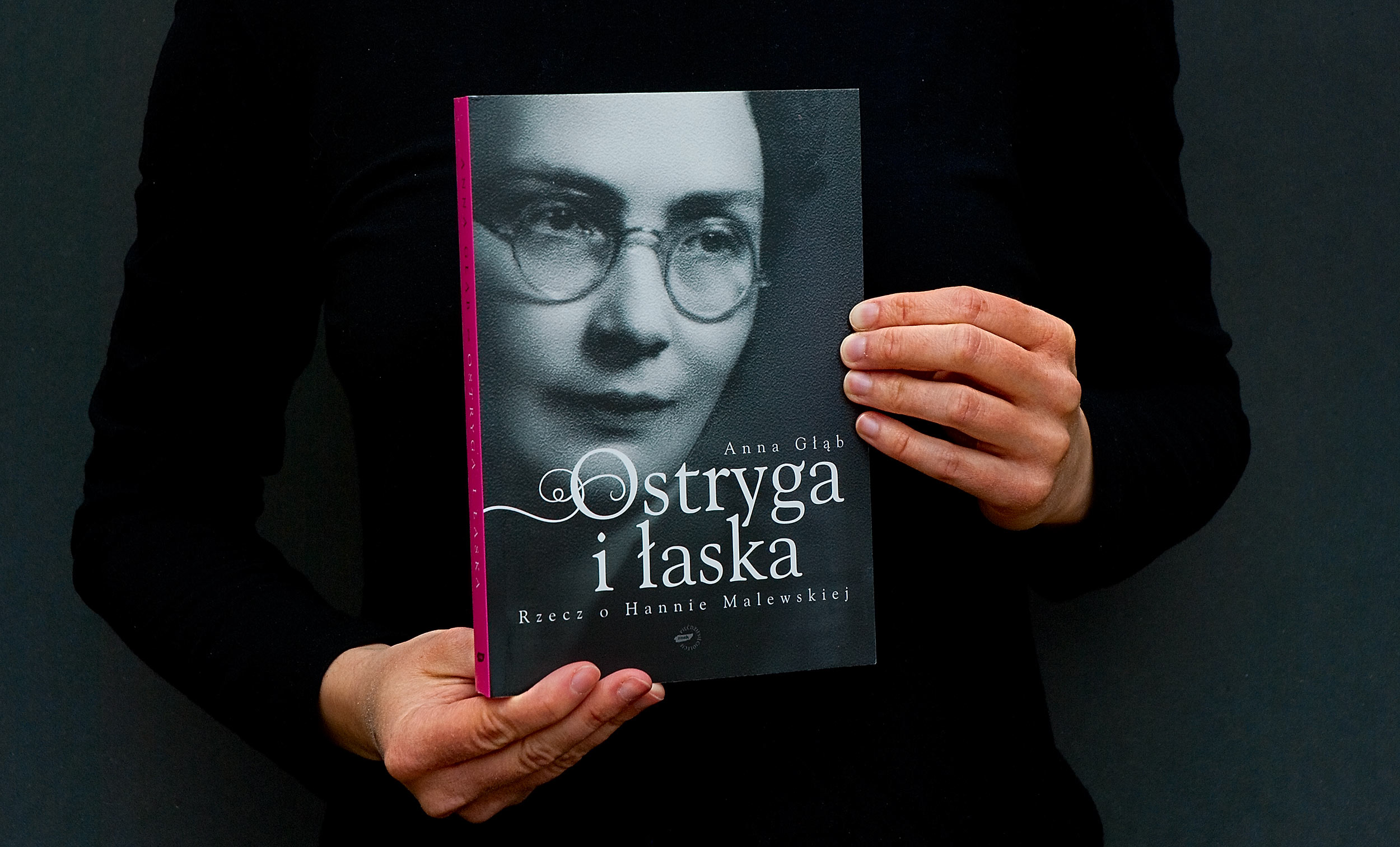
Designing book covers is probably the first commission a book designer can get. We were no different, but considering our design philosophy, it was strange for us to create just the cover without any control over the layout and the inside of the book.
Nevertheless, designing covers for publisher Znak was a great experience. It was fast-paced (we usually had only a few days to present at least three proposals), at a time it also was a solid source of income, and it gave us an inside look into ins and outs of book production in a medium-sized publishing house.
The best part of this collaboration was working with Barbara Kęsek. Among other things she was responsible for selecting covers for all of the books published by Znak. In other publishing houses the decisions were made by a group comity (which is the worst possible way), but in Znak Barbara Kęsek was choosing one of the designs and then she presented it to the editors and authors. In 9 out of 10 cases she was able to convince the rest of the them to her decision and we usually had to make only small adjustments before sending a ready-to-print pdf file.
During a period of 3 years Znak published almost 30 books with our covers.




Not all sunshine and rainbows
As with every publisher, there were some problems or annoying situations. In very rare cases the editor or book author had his/hers own ideas about the cover and was stubborn enough to push them on Barbara, and finally on us.
The most extreme example was a cover for “Priest Rafał” published in 2010. It was supposed to be some lucrative fiction about a priest living in a countryside. There were talks about a TV Show or something like that. Please don’t think about something like a HBO or Netflix. It was more like Isaura the Slave Girl (Escrava Isaura).
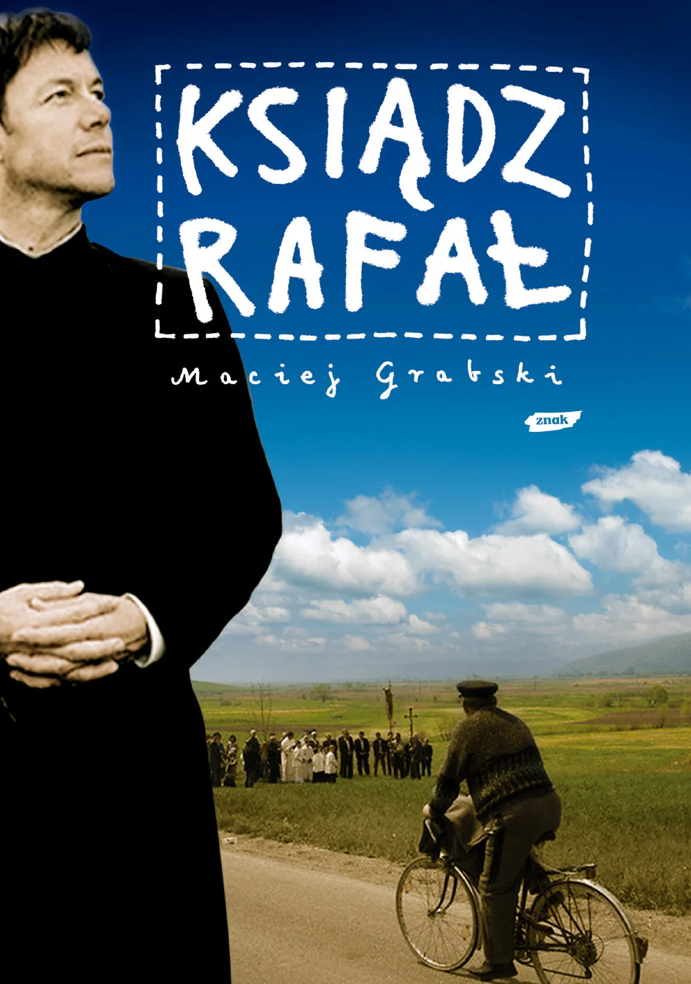
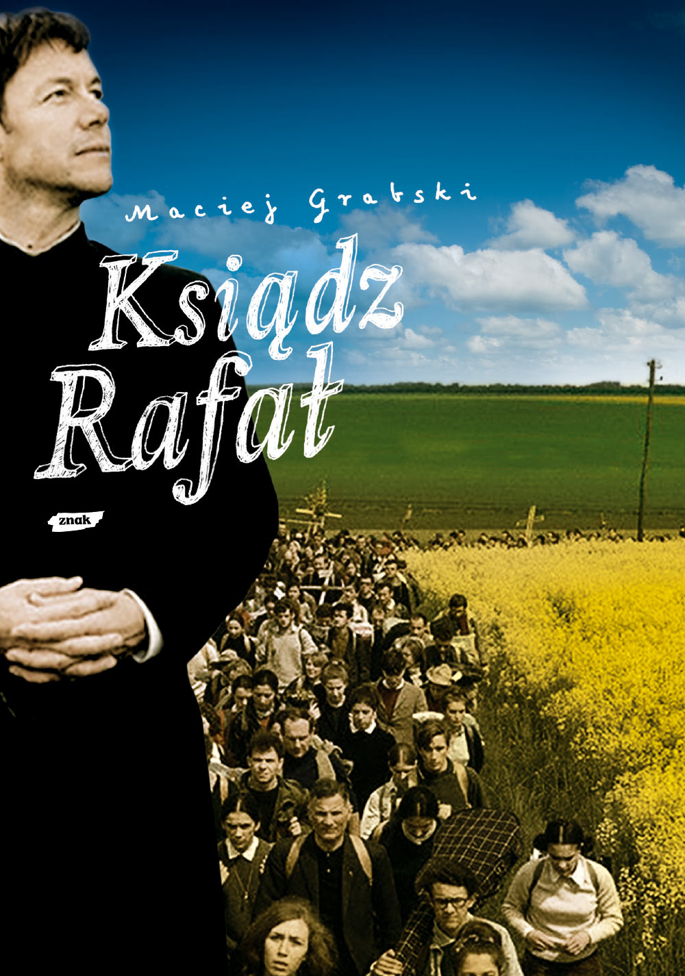
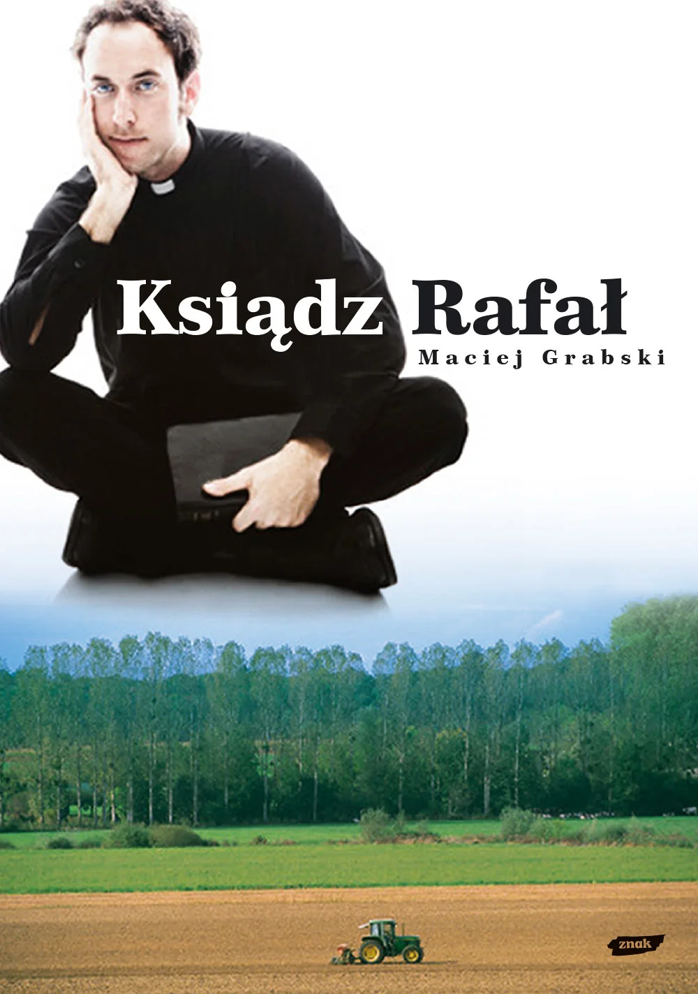
In a brief we were told that the cover had to be friendly, happy, and Polish. We searched for relevant stock photos* and, as usual, we designed a selection of 3 covers:
* When designing photo-based covers we used photo stocks suggested by the publisher, and after the image was selected, Znak bought the license.
The cover #2 was selected and we were asked to change the lettering and add more village inhabitants.
After this, everything fell apart, because decisions were made by a group of people, with the author included. We were asked to prepare a whole new cover showing that priest Rafał is close to his people. We usually haven’t prepare more then 3 versions, because the pay was just not worth it. But we had a good thing going on with Znak and they never overused their dominance before, so why not. A more friendly version of priest Rafał was created:
But this priest was not positive enough. He looked like “he had problems”, so the comity decided to go back to original three proposals and pick the first one with the following adjustments:
Add more villagers.
Add villagers with a church.
Show closeups of happy villagers.
Show just the church.
Show villagers working in the field.
Unfortunately, this version of priest was not a working man and the surroundings were not Polish enough. He was not a priest that could work in the fields. So the comity once again came up with the following suggestions:
Bikes are typical for Polish countryside.
Hay bales are typical for Polish countryside.
Poppy flowers are typical for Polish countryside.
Ow… and it had to be sunny. And so the working Rafał was created:
The new Rafał did not meet the expectations. Rafał was a young priest. He just graduated from college (or something). He needed to be a thinker. So then the thinking Rafał came to life:
Still nothing. At this point probably nobody liked priest Rafał very much. We certainly didn’t, but we wanted to make one last effort and go with something new. Maybe if Rafał was just a regular guy, we could show it without placing his face on the cover.
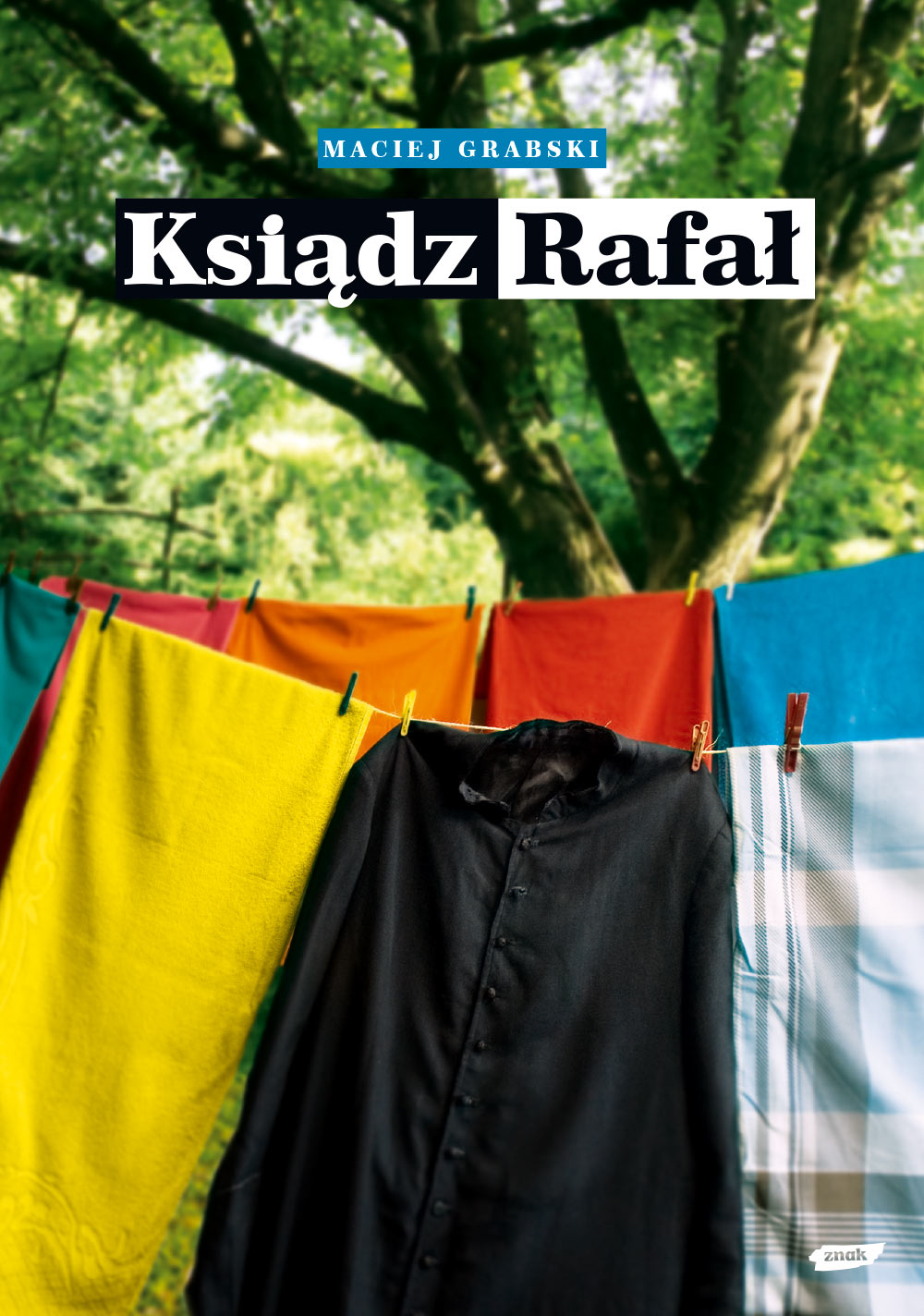
We rented a Catholic cassock and photographed it in our apartment:
Using those photos we presented a new proposal:
Unfortunately we were missing the Polish vibe. What is the most Polish think you can think of? Well… apparently those are apples and sunflowers.
We’ll spare you the rest of this process and just dump the rest of the versions below. Apples won. Book was published and we don’t know if it had any success or recognition.
As we wrote at the very top of this page, creating covers can be exiting and satisfying. It’s just not always like that. We’re glad we had that experience and we’re happy we don’t have to do it anymore.


