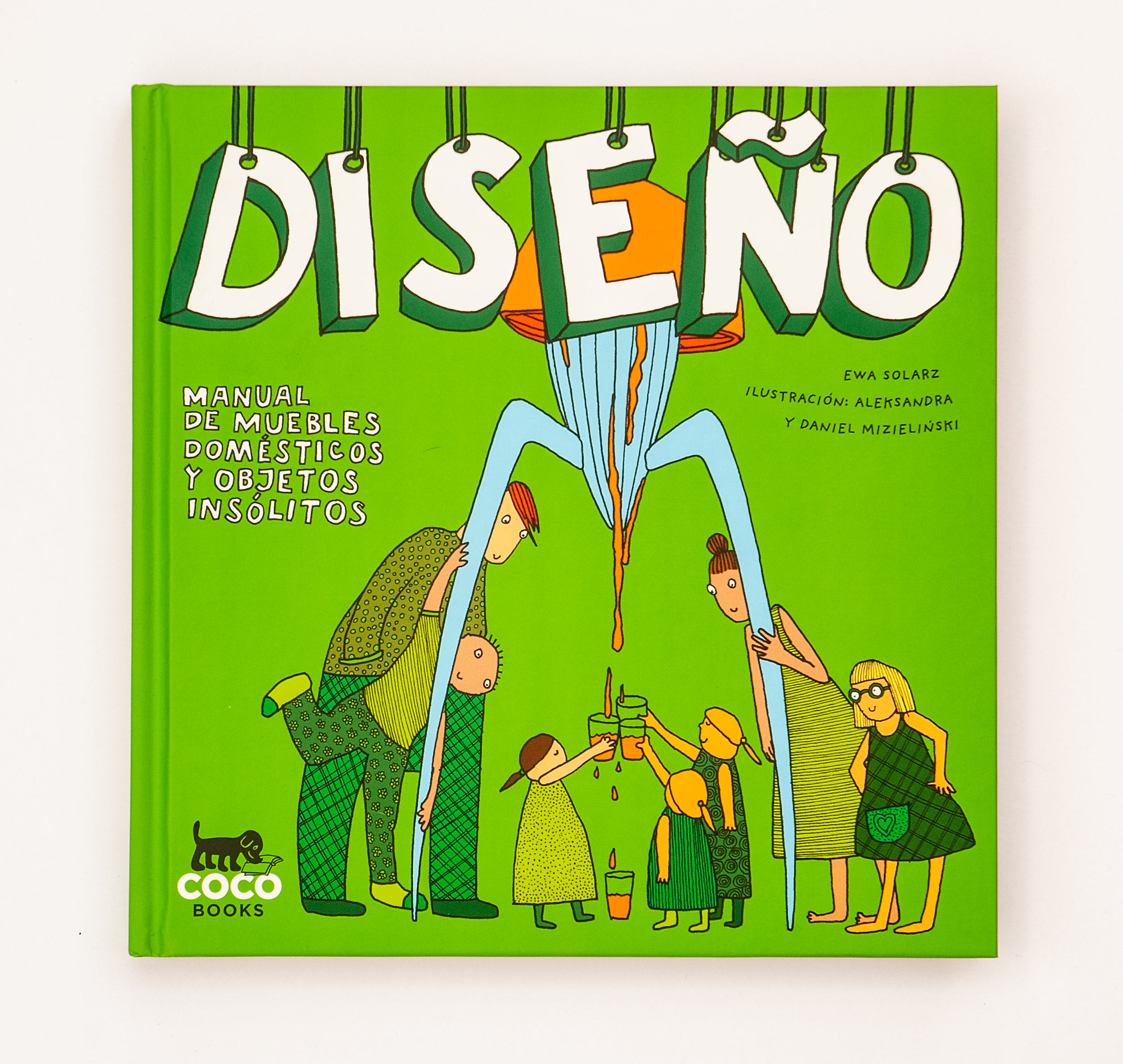
D.E.S.I.G.N.
Publisher: Wydawnictwo Dwie Siostry
Text: Ewa Solarz
Illustrations, layout and texts on the illustrations: Aleksandra and Daniel Mizielińscy
Warsaw 2010
Dimensions: 20 × 20 cm
Hardcover 168 p.
ISBN: 978-83-63696-29-0
Since 2022 also available as stitched paperback
Dimensions: 19 × 19 cm
Hardcover 172 p.
ISBN: 978-83-8150-350-1
This book is a part of the S.E.R.I.E.S.

D.E.S.I.G.N. is a mind-boggling survey of seventy intriguing objects designed over the last century. Anecdotal and humorous, it portrays both the classy and the crazy: a boxing-ring bed, a baseball glove chair or a skeleton mirror. D.E.S.I.G.N. illustrates the omnipresence of objects in our lives. It invites us to appreciate not only their extraordinary shapes, but also their ordinary functions.
This is the second volume of the educational S.E.R.I.E.S.. Unlike in D.O.M.E.K., we didn’t write the main text, just the side notes that are scattered across the illustrations. Other titles in the series that we worked on are: D.O.M.E.K., S.Z.T.U.K.A., and M.U.S.I.C..
For this book we used FF Good by Łukasz Dziedzic for the body text and FF Gothic Condensed by Neville Brody for titles and emphasis. All of the side notes were handwritten, but in foreign editions they were typeset with our font Mr Orange.
Working with other authors is quite different than working on author projects and, to be honest, more demanding. Good picture book is a symbiosis between the languages of words and images. Both have their strengths and weaknesses and it’s great if you can control what part of the story or information is communicated in which way. A lot of writers don’t know how to write for picture books in which case illustrator have a tough nut to crack. Can I ask for a rewrite because some parts of the text should be shown on illustration and it’s stupid to mirror them in the text? Or do I draw something new on this subject and expand or even change the given content?
Another problem is that in a picture book the illustrator is by definition a co-author. So what do you do if you disagree with some parts of the main text? One solution is for all authors to work together from the start. If you can’t, the only person that can save you is a good editor. We’re very lucky to be able to work with one and nowadays we refuse to do any book without Maciej Byliniak’s help.
During the process of creating D.E.S.I.G.N. we learned a lot on this topic. In the end the collaboration with Ewa Solarz ended with a book that we’re proud of and we knew how to approach the next books in the S.E.R.I.E.S..
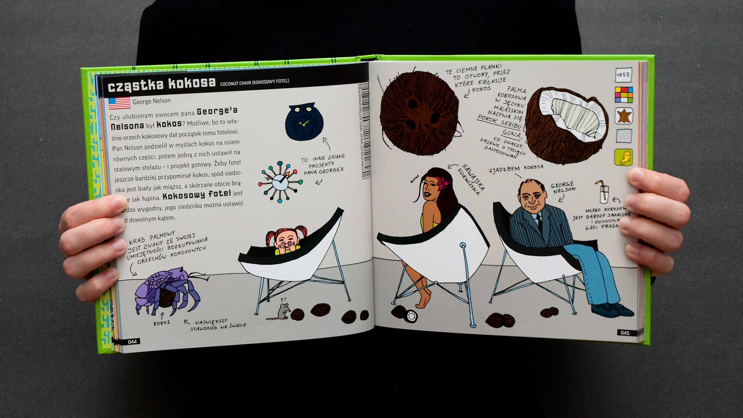
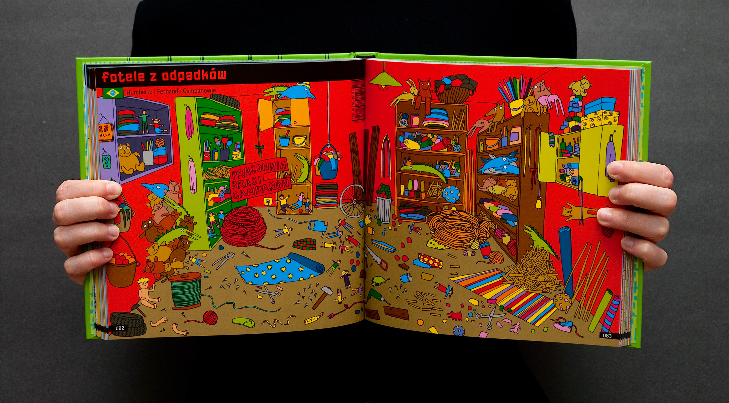
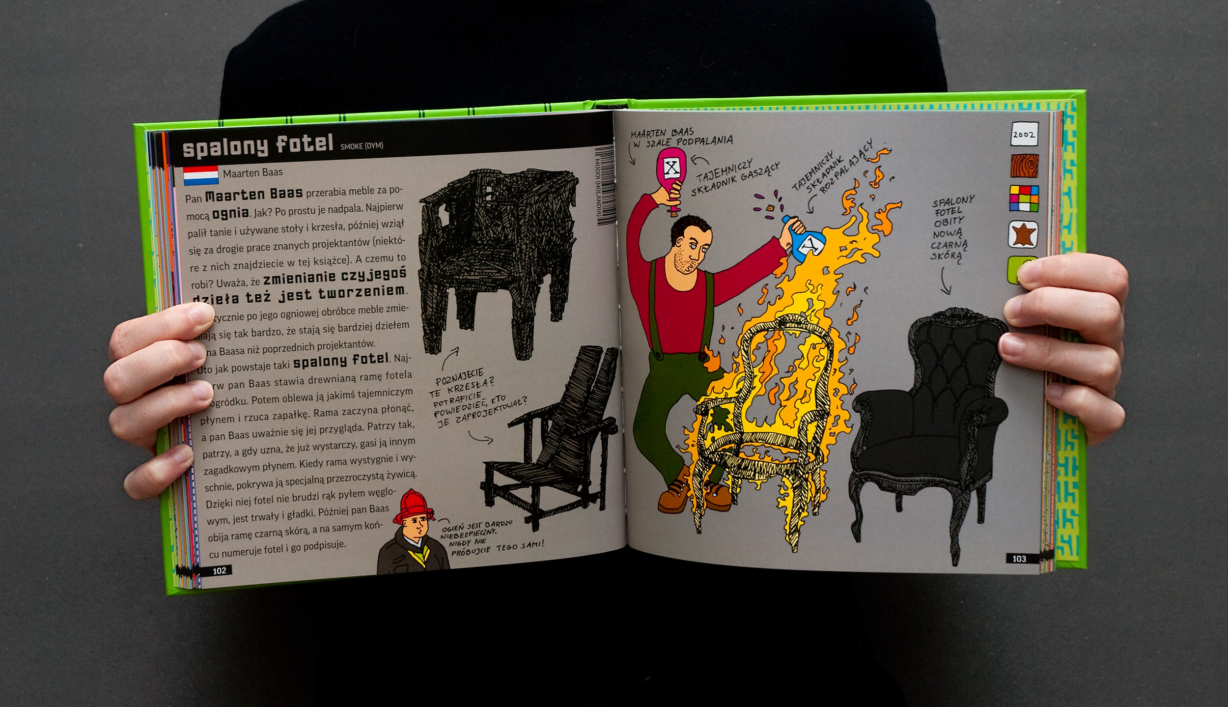
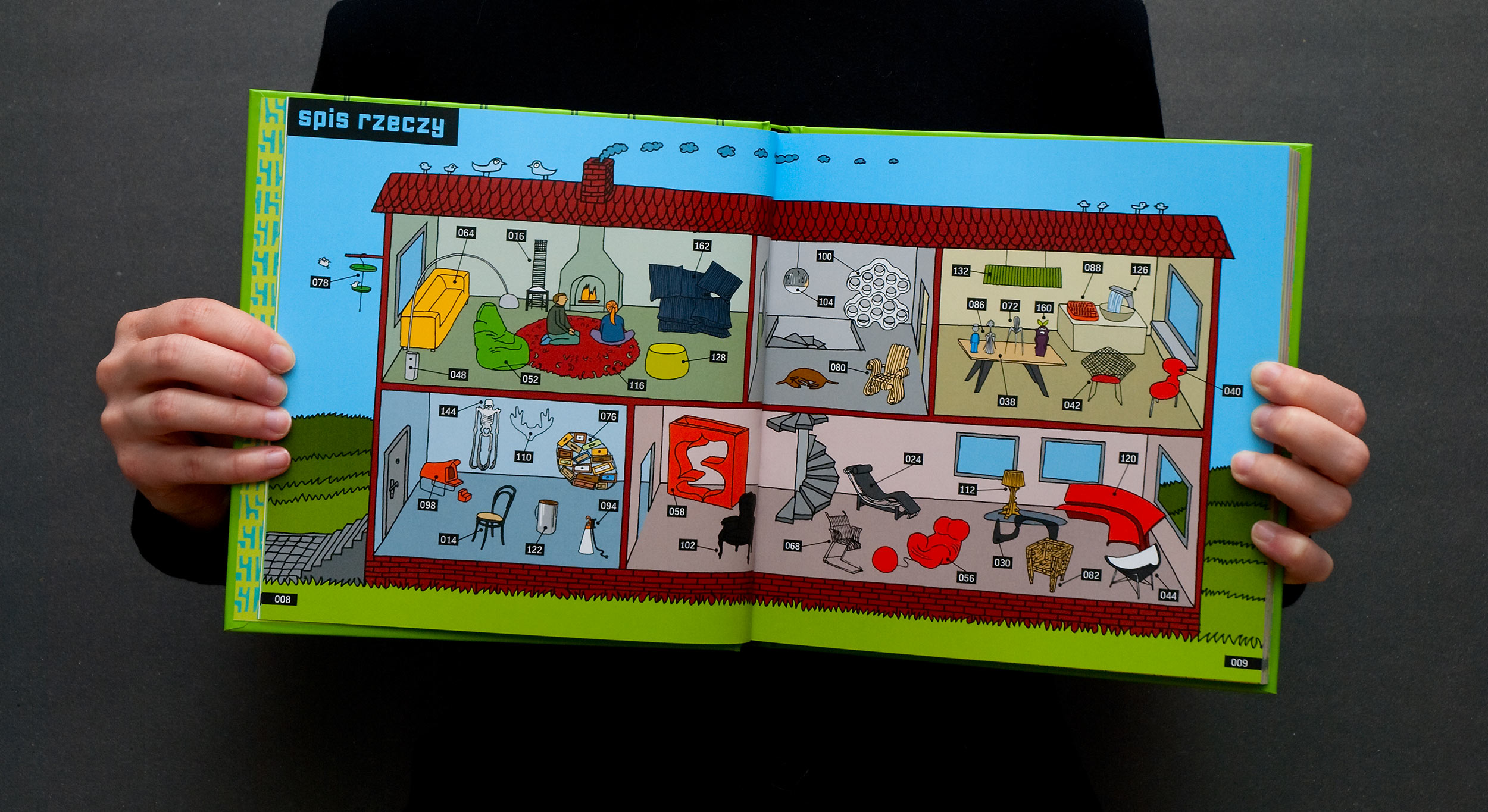
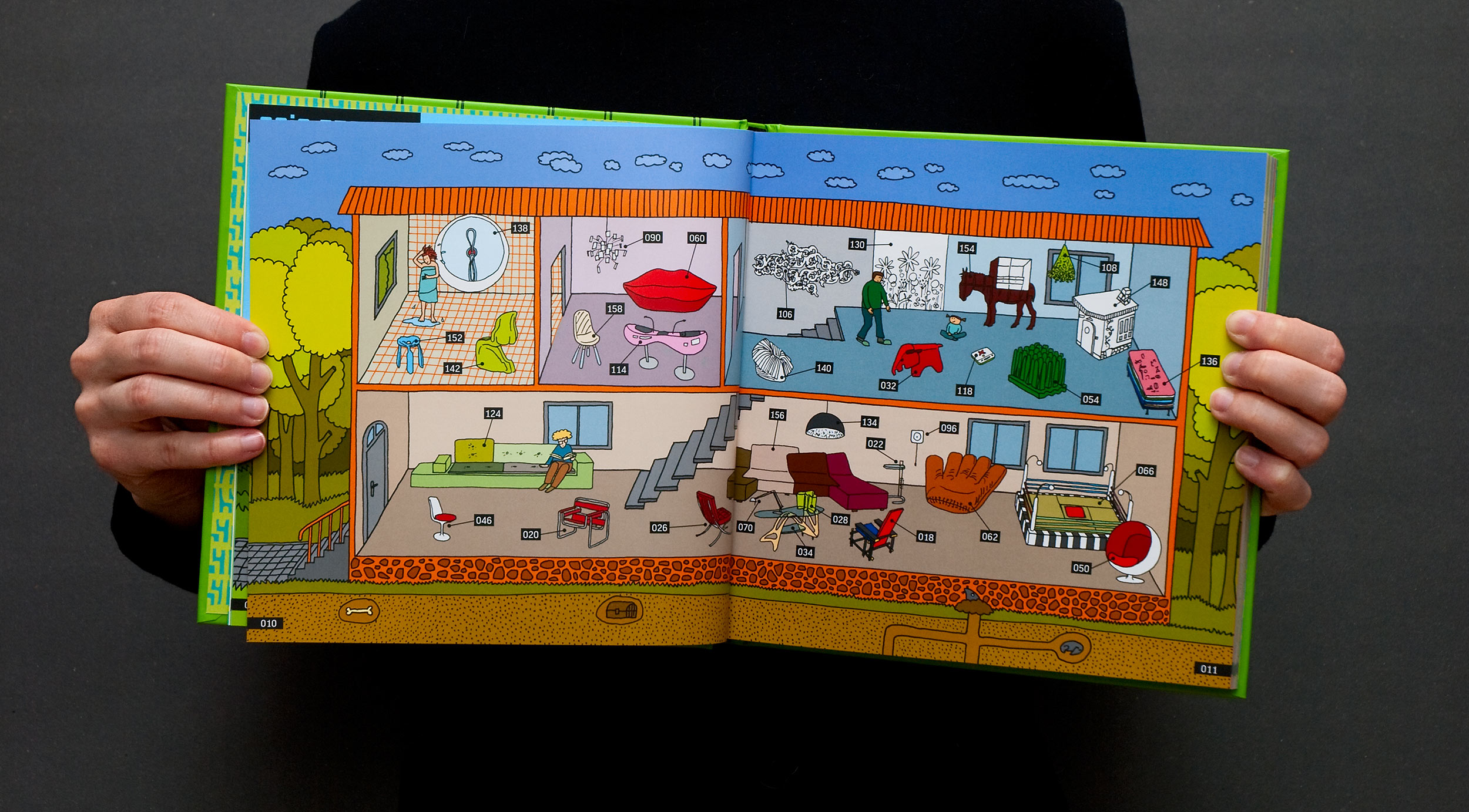
We wanted D.E.S.I.G.N. to have a different layout than D.O.M.E.K.. In the matter of fact we wanted all of the books in the series to have their own layouts. We kept the structure: title on the left, the original name next to the name given to the object by Ewa, flag of the designer’s country and icons on the right. We changed typography and layout. This time most objects got just a single spread and there are fewer spreads with nothing more than a fun side story on them.
As you can see, there are no vector drawing (like the buildings in D.O.M.E.K.). Everything was drawn on a paper and then colored in Photoshop.


One big difference is that this time we knew that D.E.S.I.G.N. is going to be printed in co-edition (please go to D.O.M.E.K. for more info) so we could build our project on top of that and not bend it after all the work was done.
For example, the letters in the titles have different colours on every page but they are actually rendered by the black paint from the black bar. The colour used for the title is printed underneath the whole title bar and the bar is overprinted on that colour. Letters are like a cutouts in a layer of black paper. This way, when the new language version is printed, we could replace the title by just changing a single colour plate and not the whole CMYK.

This last spread has two stories behind it. First one is purely technical, because I think it’s a smart approach to the problem of co-edition. You can see light coloured letters with a black stroke printed on a darker color. This is all achieved by printing a light black tint over the whole background. All the strokes are 100% black and the difference between the light green colour and the dark green background comes from the black tint. So again only single offset plate has to be changed.
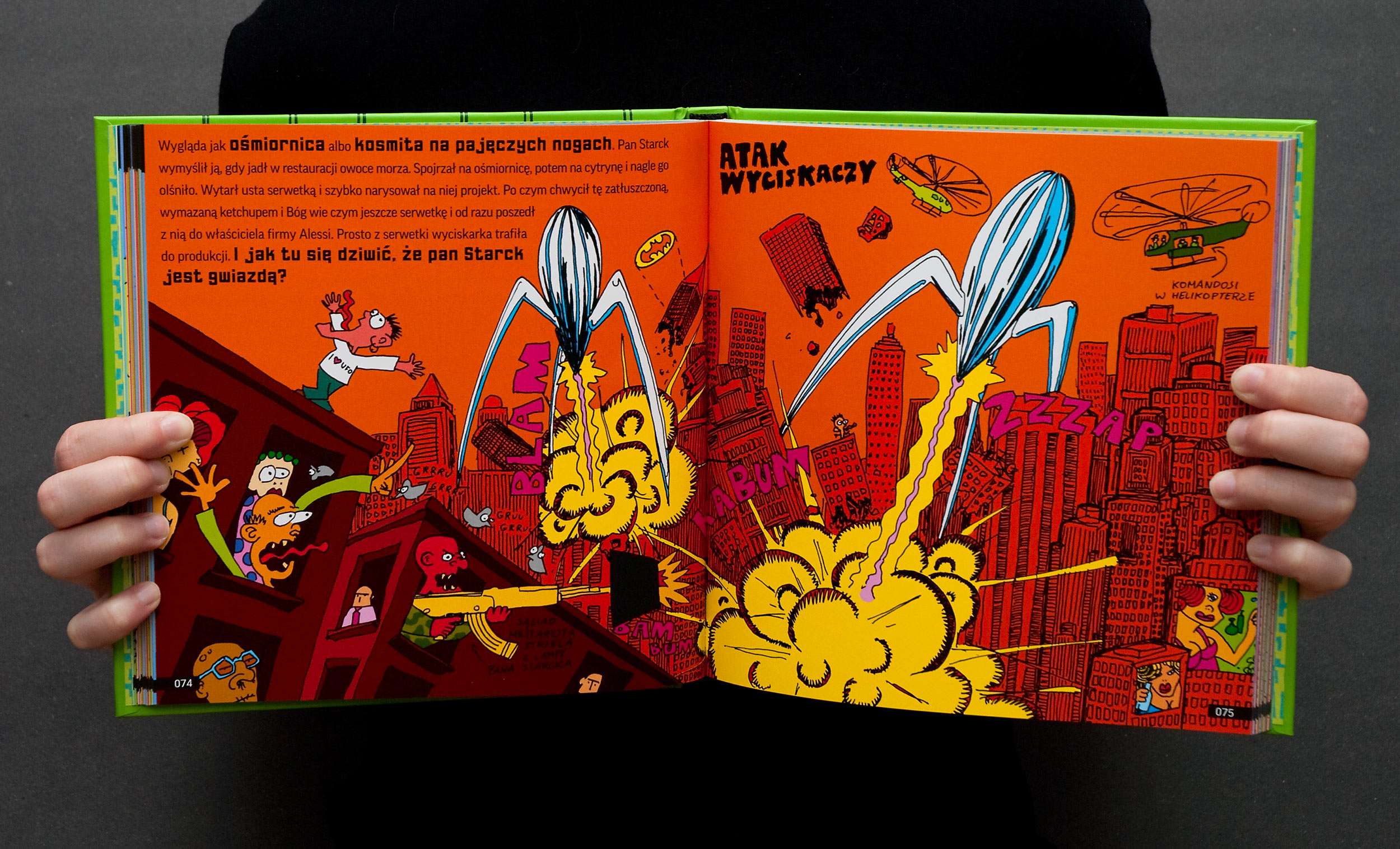
The second is a complaint from a mother that wrote to us with anger how her 8 year old boy vomited when he saw the snot monster and that she had to glue those pages together to protect her child. This spread was supposed to show your favourite horrors and abominations so I’m guessing… mission accomplished? No?
Foreign editions
Chinese Simplified, 设计之书, Tsinghua University Press, 2017, ISBN 978-7-302-45ISBN 978-1
Czech, D.E.S.I.G.N., Jana Kosteleckà, 2015, ISBN 978-80-260-8277-4
Korean, 상상하는 디자인, Pulbit Publishing Co., 2015, ISBN 978-89-7474-487-8
Dutch, D.E.S.I.G.N., Book Island, 2013, ISBN 978-0-9876696-4-3
Catalan, DISSENY, Coco Books, 2012, ISBN 978-84-940032-1-9
Chinese Traditional, 全世界最精采的設計, Prophet Press, 2012, ISBN 978-986-134-192-7
Danish, D.E.S.I.G.N., Turbine, 2012, ISBN 978-87-7090-952-5
Lithuanian, D.I.Z.A.I.N.A.S., Modernaus Meno Centras, 2012, ISBN 978-609-95406-0-3
Spanish, DISEÑO, Coco Books, 2012, ISBN 978-84-940032-0-2
French, D.E.S.I.G.N., Mila Éditions, 2011, ISBN 978-2-840-06626-2
German, Farbe Form Orangensaft, Moritz Verlag, 2011, ISBN 978-3-89565-229-5
English (NZ, GB), D.E.S.I.G.N., Gecko Press, 2010, ISBN 978-1-877467-83-7
Italian, D.E.S.I.G.N., Comma 22, 2010, ISBN 978-88-65030-50-9
You can find a Google Sheet with a list of all our foreign editions here.