
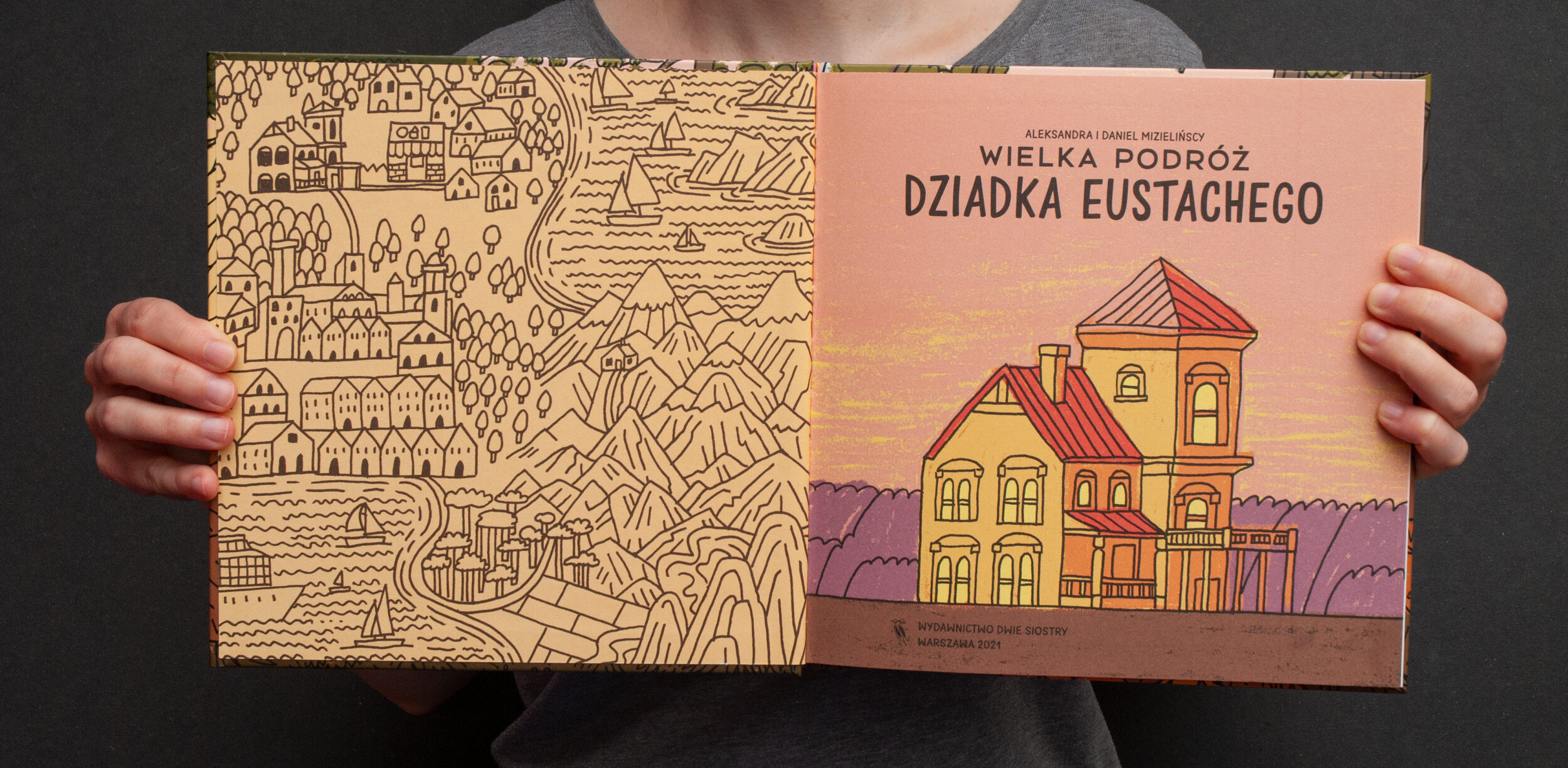
Wielka podróż dziadka Eustachego
English title: Grandpa's Eustachy Great Journey
Publisher: Wydawnictwo Dwie Siostry
Warsaw 2021
Dimensions: 22 × 22 cm
Hardcover: 44 p.
ISBN: 978-83-8150-224-5

Blurb from the publisher:
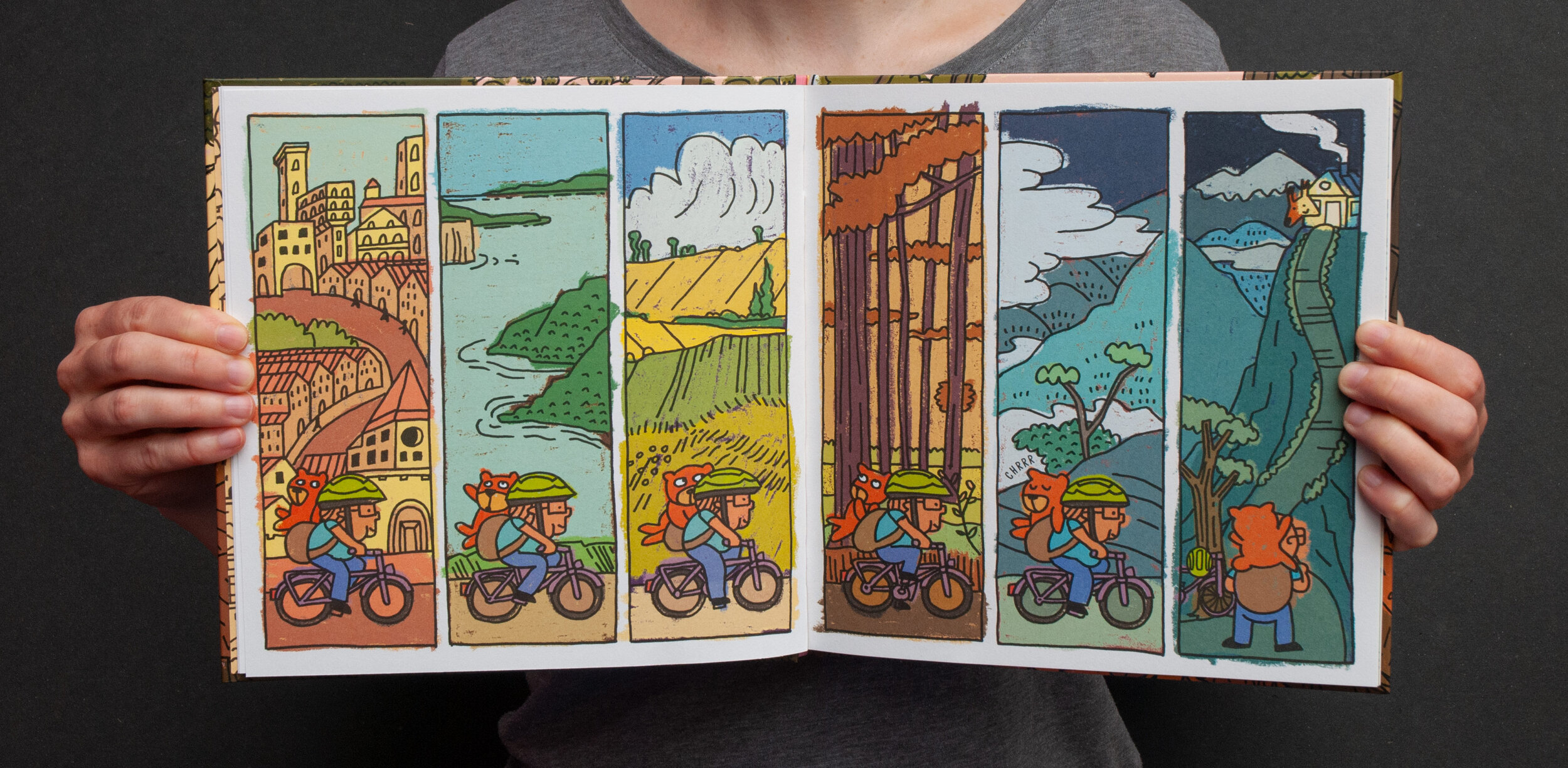
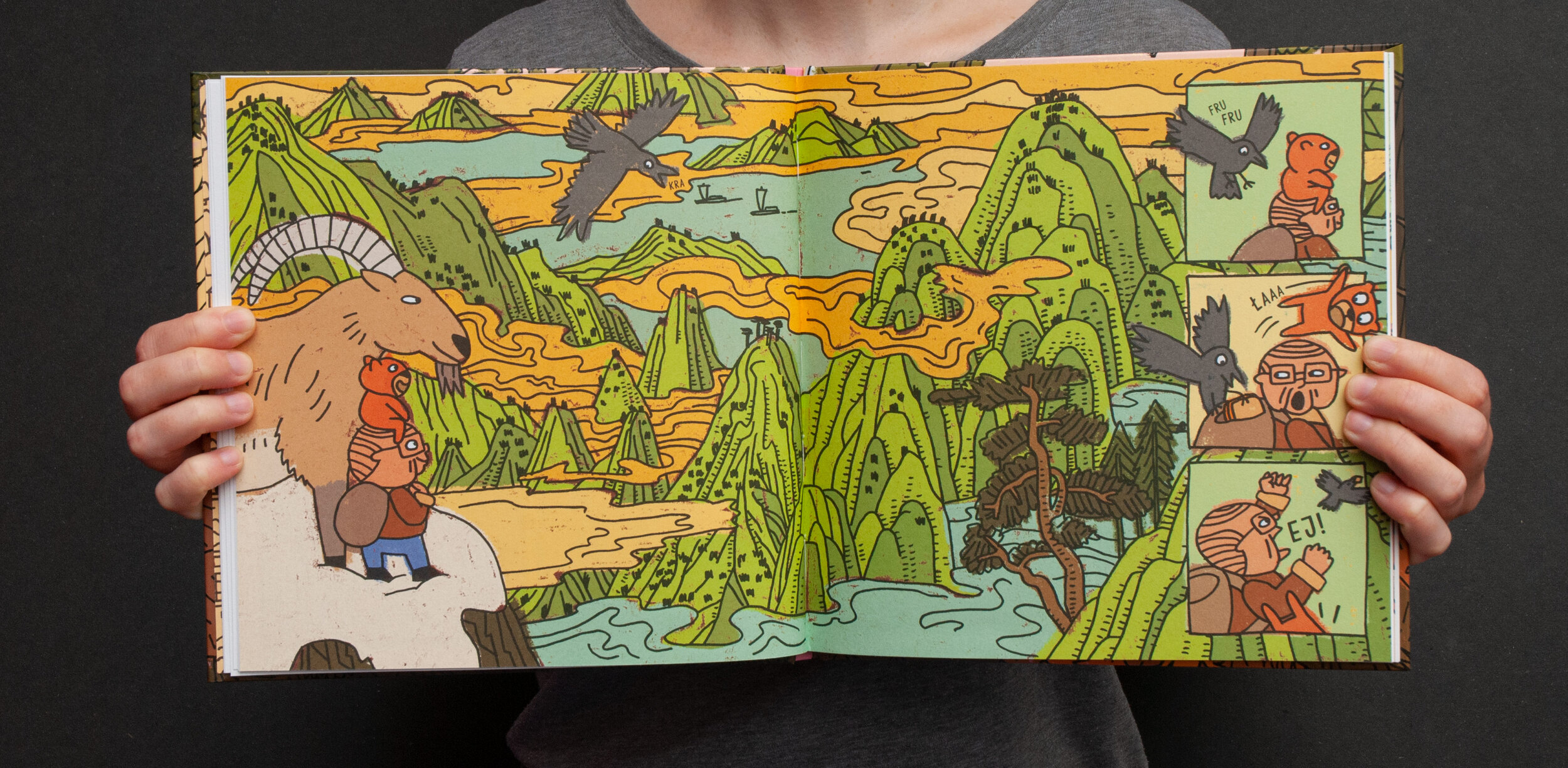
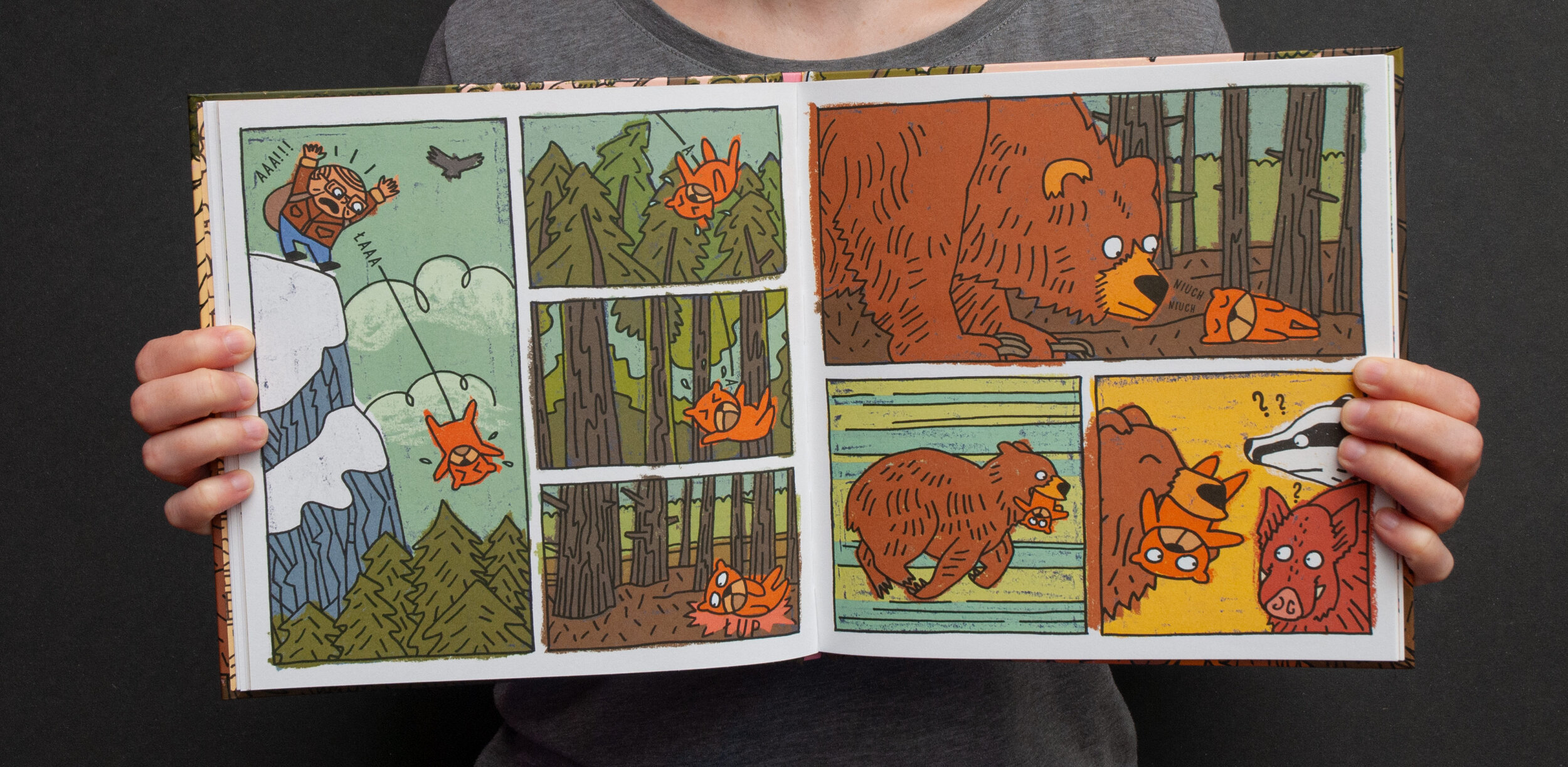
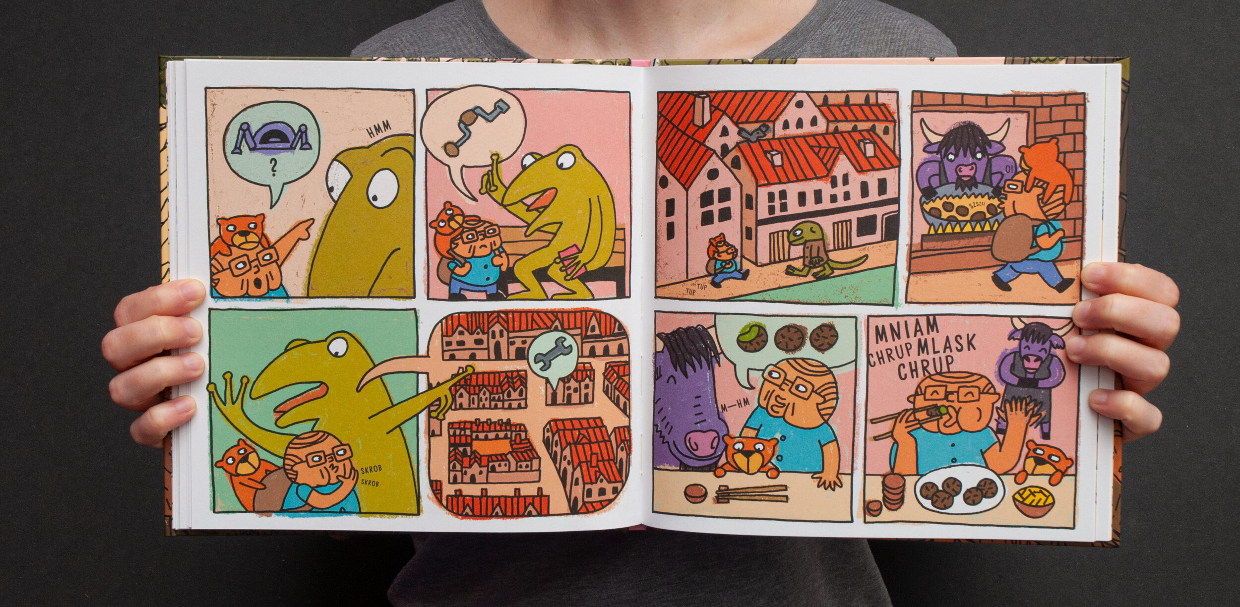
A colourful silent graphic novel for the youngest readers. Grand-dad Eustachy is setting out for a big journey. He packs his backpack, jumps on his bike and is off! A long journey awaits him, filled with adventures: overnighting at the squirrel’s, a mountain hike on a buck’s back, an encounter with a family of bears, a ride on a catfish taxi, resting in a hostel run by bees and much more! Will he be able to arrive on time and bring the gift in one piece?
After finishing Which Way to Yellowstone? and Have a bite, and before engaging in another 3 year project, we wanted to create a small and funny fictional story. Researching and writing our big non-fiction books can take a toll on us, and we were already gathering materials for our next big project. We needed a break. A break to have time to work on something else.
Since finishing Mamoko series we’ve been talking about an idea for an adventure book series for very young children. A comic book with no dialogues and fast-paced action. With suprising characters and magical, yet familiar places. A world very different from ours, but in a way that dreams sometimes distort things we know from real life. This was a great opportunity to finally put those thoughts to work.
Why comics?
Comic books are great for young children. They can teach the basics of visual communication and storytelling. Unfortunately, there aren’t many comics for kids who can’t yet read. And for 3–5 year olds comic books are an exiting space where they can dive into the unknown and understand how ones actions can be followed to their conclusion.
We wanted to have our input in this niche: a happy adventure with few plot twists and enough side stories to inspire children’s own ideas.
My first comic book series
“Grandpa” is supposed to be an opening of a comic series. We would love to develop more characters and stories, but this is an experiment and we don’t know how this book is going to sell, so the volume number denotation was removed from the first print run.
We hope to take the readers to even more absurd places, but there is also different idea for expansions. we can’t write about it, and maybe if Eustachy becomes a flop, we never will. But we want to leave that hint here for future reference.
Make it the hard way
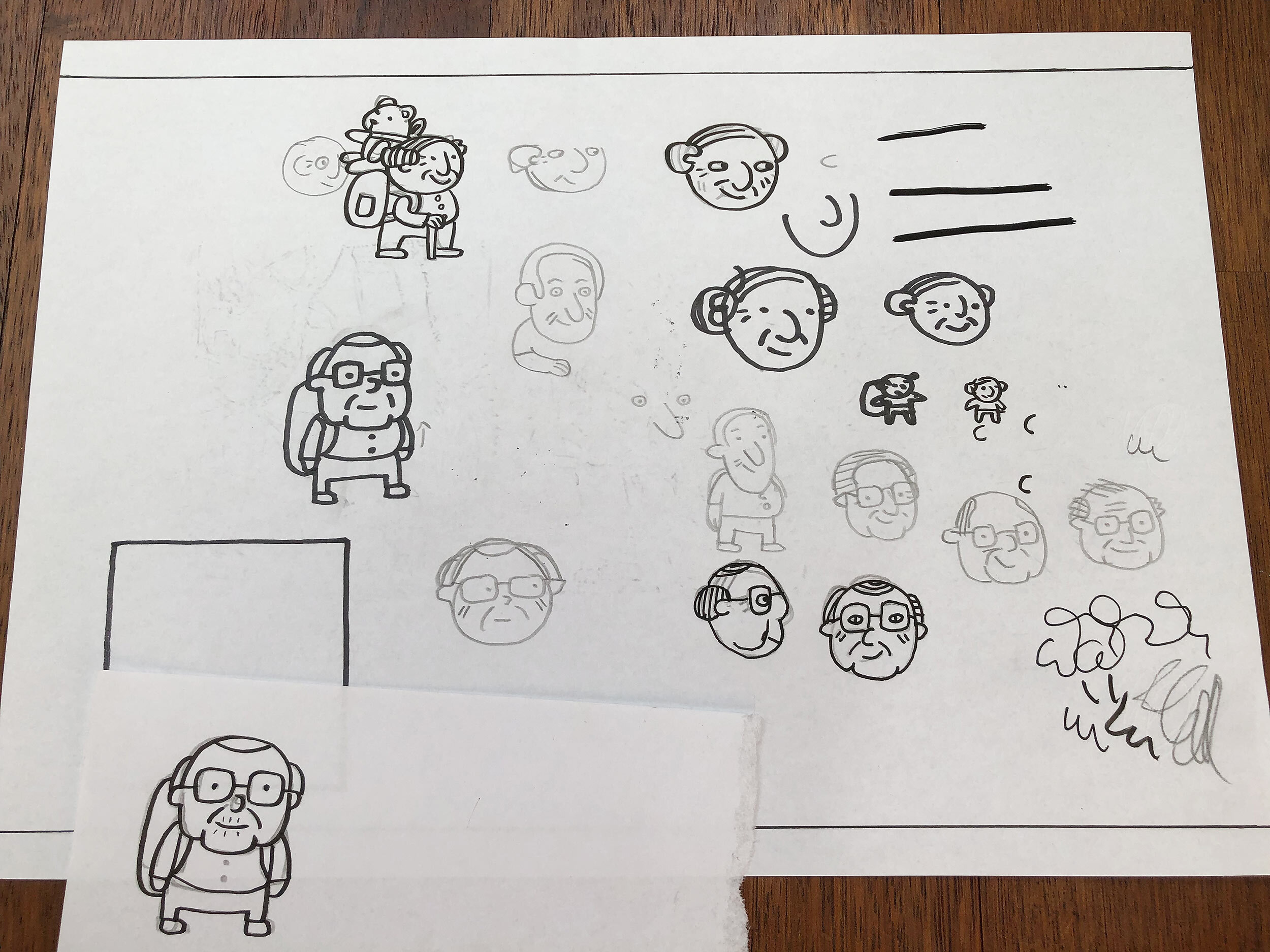
First thing we did after deciding to draw “Grandpa’s Eustachy Journey” (he didn’t even had a name back then, we just called him “Grandpa”) was to wright/draw the story. As you can see below, we just needed two A4 sheets of paper and a day of work. For the next two or three days we expanded the initial storyboard with more detailed notes (all made in Google doc). That was it for the writing part.
The drawings were supposed to have a very offhand look. Simple, funny, and fast line-art coloured using chunky and messy oil pastels. Just layers of thick colors.
We started with the character design. After few sketches Eustachy was ready to go.
Then scale. We always draw on paper, and you can get different results, depending on whether you’re drawing in natural scale (same size as the images would have in a printed book) or smaller/larger size. Almost all of our books were drawn in natural scale. Mamoko series was drawn on a much bigger sheet, and Co z ciebie wyrośnie? was drawn on a half size area.
Drawing smaller images and enlarging them gives a heavy, organic texture. You can really feel the paper and tools. For this book images were scanned with doubled resolution, and then downsampled to 66%.
Each spread was sketched with pencil and then traced on a thin layout paper using thick (0.8 mm) UniPin liner. Each panel was drawn as a separate image, with a separate frame. We prefer to have all the elements on different layers.
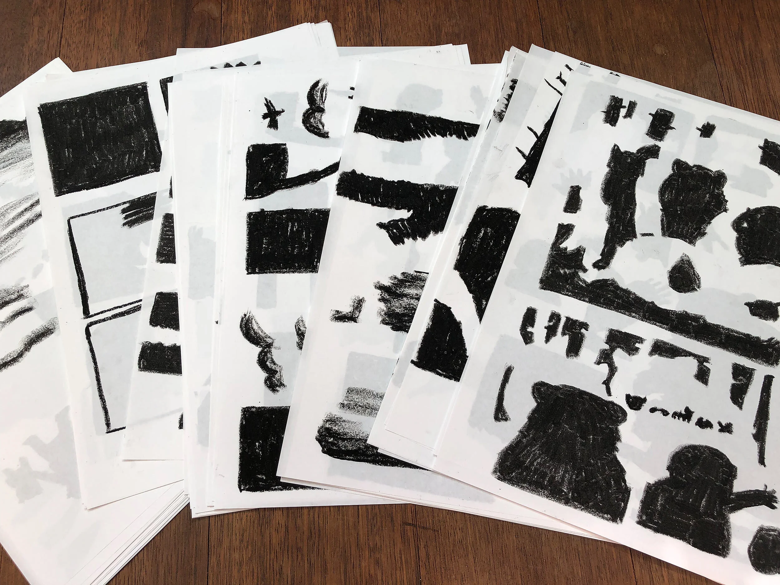
The colouring was not that easy. For Have a bite we created many of Photoshop brushes, but this time we just couldn’t match anything that truly looked like oil pastels (in real life the randomness of oil pastels texture is very specific and hard to reproduce inside the Photoshop two layer brush system). After a day or two of trying, we decided to colour everything on paper using real oil pastels. Well… “colour” maybe is not the right word. We needed shapes and textures. It’s always easier to adjust or select individual colors in Photoshop.
Thats why we used only black pastel. We would put a fresh sheet of layout paper on the top of a finished drawings and just fill all of the areas. The pastel isn’t a precise tool and drawings were small, so the colour bled nicely beyond the contour and panel borders. More detailed separation was made in Photoshop (e.g. main character with a teddybear was usually coloured as one shape that was later divided into areas for face, shirt, backpack, bear, etc.).
Those black areas were converted to Photoshop’s solid colour layers with masks. This way we could change them to any printable colour with just two clicks.
For more chunky feeling, we filled every panel with a rectangle of oil pastel texture, and on top of that applied shapes for different elements. This way e.g. a pink background you can see scraps and bits of different color underneath. This effect gave us depth that pastels have in real life.


Wanderer above the Sea of Fog
As usual, we had to smuggle some famous paintings into our books. The artist whose work was closest to what we wanted to achieve, was Caspar David Friedrich. His Wanderer above the Sea of Fog is one of the best depictions of landscape ever created. The man in the center is facing a great adventure. Is he excited, scared, overwhelmed? We don’t know. We can’t see his face, but because of that we can be him and just breathe-in the cold morning breeze.
This anticipation of an unknown journey is what we wanted to have on the cover. Unfortunately, we were faced with a hard no from the sales department, because “the characters’ faces draw attention”. There were also concerns that our cover allegedly reminded another cover. Or maybe Dwie Siostry team just didn’t like it.
Whatever it was, we didn’t want to abandon the Friedrich direction. Simply turning the grandpa around would destroy the idea, so we reached for another Friedrich masterpiece. The final result might be a better cover, but we still really like the original concept.


Gingerbread cookies
Every Christmas our friend and co-worker Zosia Frankowska prepares gingerbreads for her friends. In 2020 she gave as a huge bundle of cookies inspired by Daj Gryza (you can find images here). This year among a boardgames inspired themes we found Eustachy with his friend. As usual before eating them all we made some pictures.


