
D.O.M.E.K.
English title: H.O.U.S.E.
Publisher: Wydawnictwo Dwie Siostry
Warsaw 2008
Dimensions: 20 × 20 cm
Hardcover 152 p.
ISBN: 978-83-608-5030-5
Since 2022 also available as stitched paperback
Dimensions: 19 × 19 cm
Hardcover 156 p.
ISBN: 978-83-8150-349-5
This book is a part of the S.E.R.I.E.S.

Have you ever seen a house without walls? Is it possible to pack a house into a suitcase? Can a house behave like a turtle? What kind of house can homeless people have? Would you prefer to live in a moon, in a nut or... inside a sewage pipe? Architecture is amazing! Discover 35 houses from around the world. Learn more about the amazing art of design and construction.
This is the first volume of the educational S.E.R.I.E.S.. It was our debut and the only book within the series that we’ve both written and illustrated. Other titles in the series that we worked on are: D.E.S.I.G.N., S.Z.T.U.K.A., and M.U.S.I.C..
D.O.M.E.K. was our first commission for a children picture book. We got it after showing few of our non-published books to the publishers. We printed and bound those projects to make them look like real books from a bookstore. About 4 or 5 months after our first meeting we were contacted by Dwie Siostry and they asked us to create a book about architecture. This was the entire brief. Together we decided to make a book about houses, as the function of rooms in a household is understandable for every child.
In the research phase we tried to single out existing houses designed by famous architects. If we found a funny or intriguing story behind the design, we asked architect Jacek Rzyski if the selected building is not some kind of dud.
For this book we used Eurostyle Regular and Black font for the body text and Corinthian Light for titles. In the updated for co-edition version (for more, see below) we changed the titles into handwritten letters, and for the last version we went back to Corinthian. All of the side notes were handwritten, but in foreign editions they were replaced by our font Mr Orange.
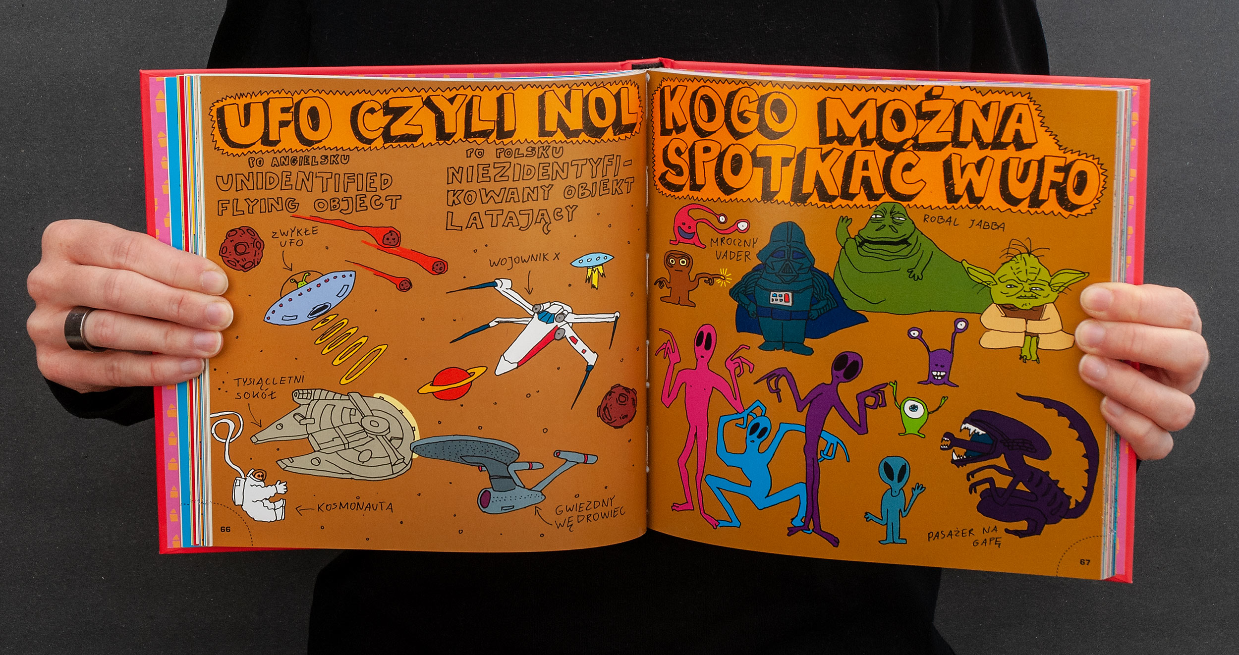
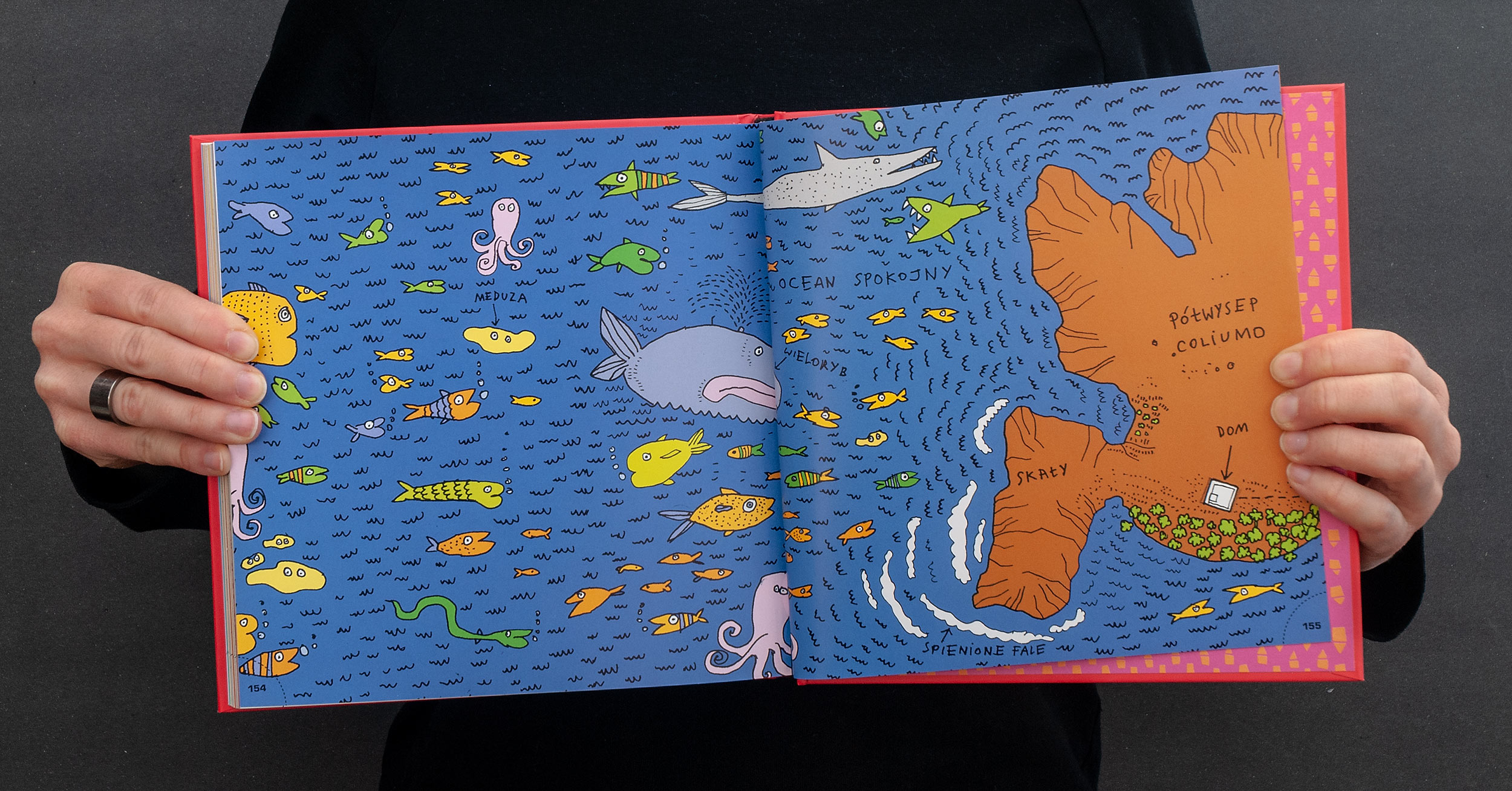
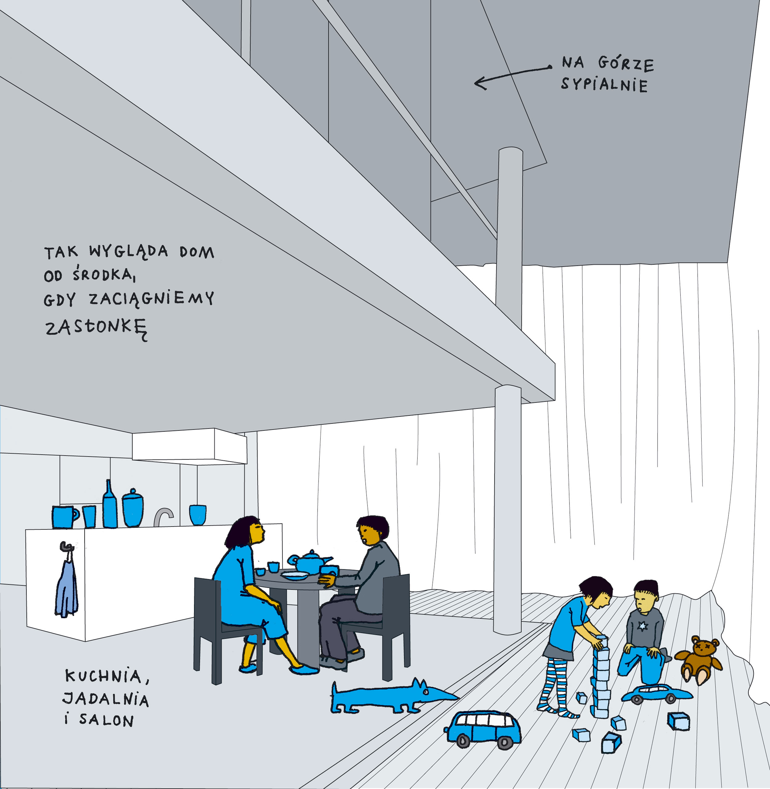
We wanted the narration of this book to be a little less linear than in a typical book, so we added lots of side stories, comic like dialogues, icons, and spreads with aliens or monsters very loosely related to the house theme. The reader can skip the main text and just read the sidenotes and curiosities scribbled on the margins. In the matter of fact the main text was written after most of the book was aleready finished.
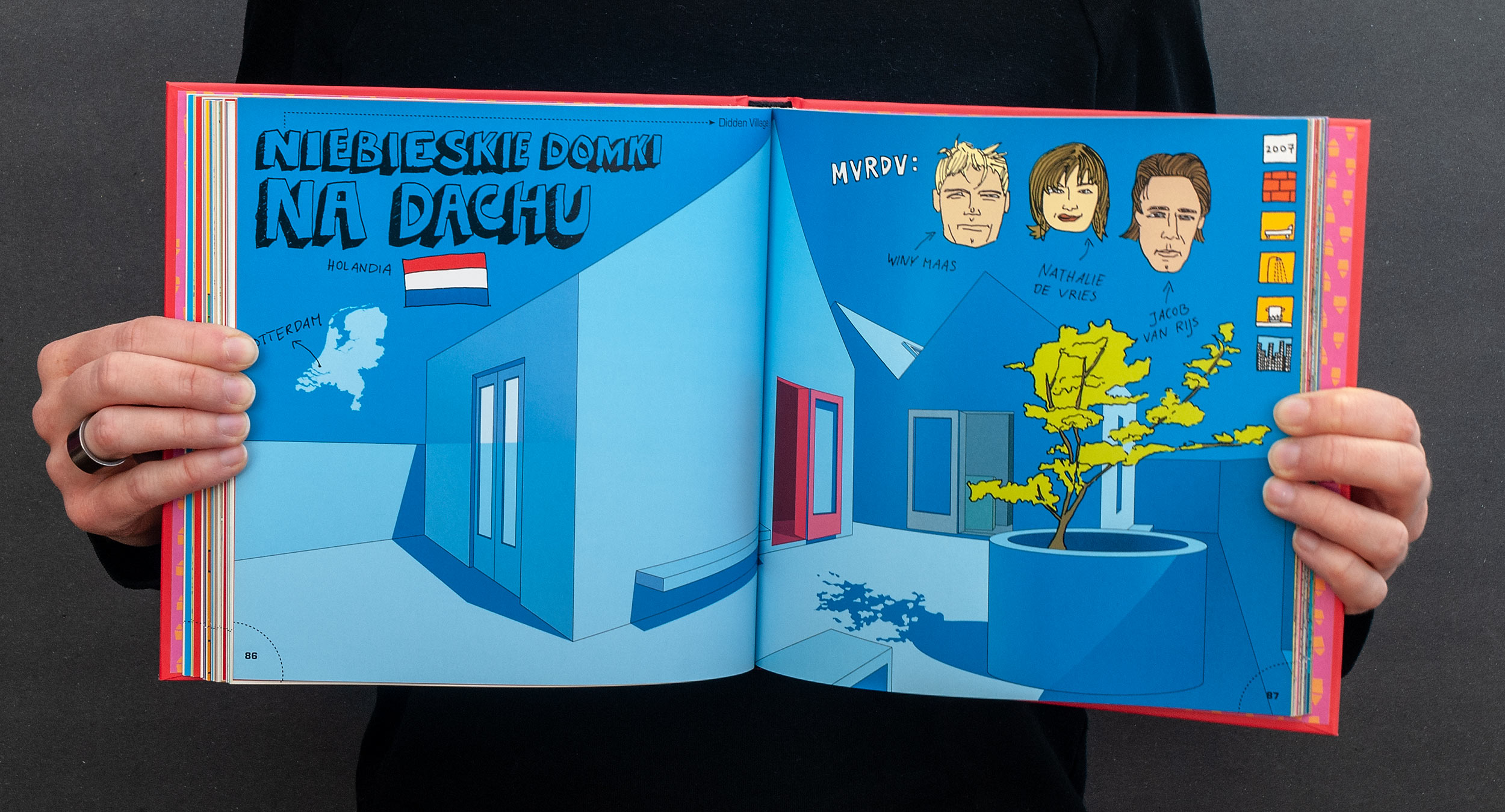
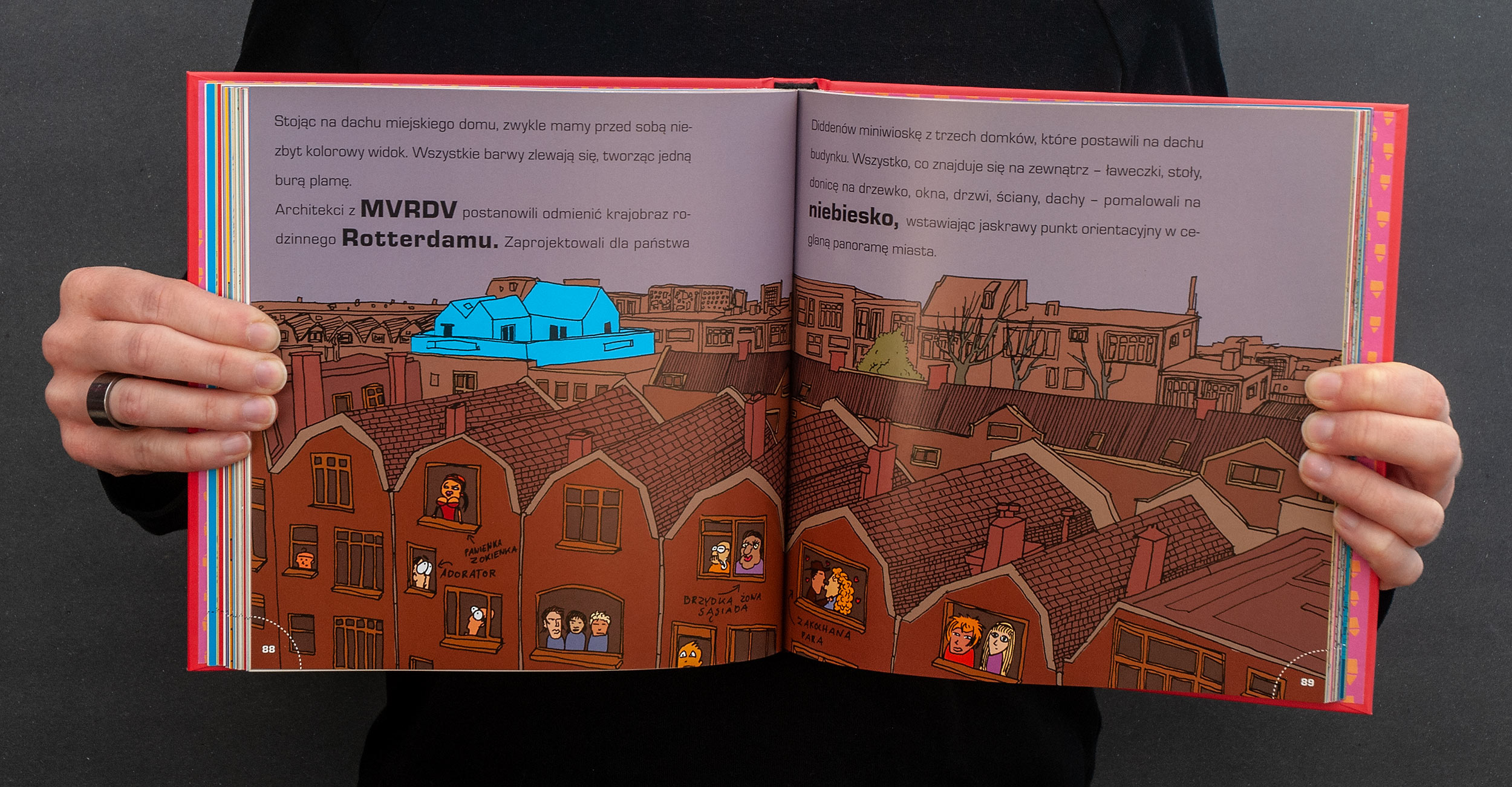
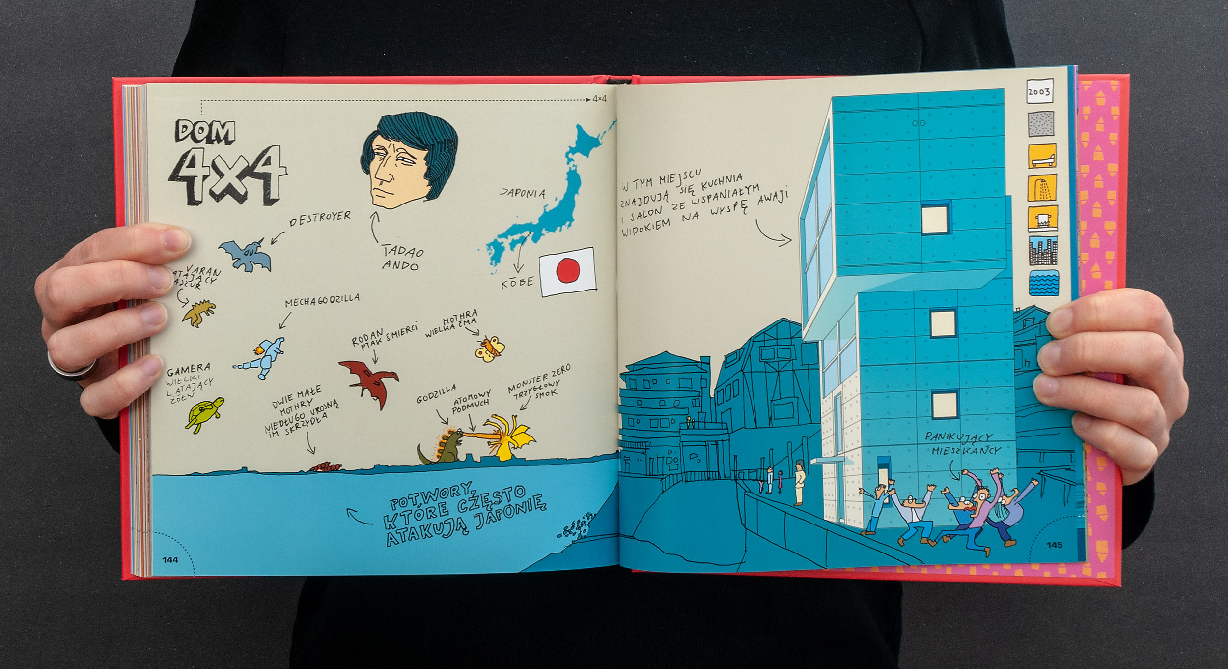
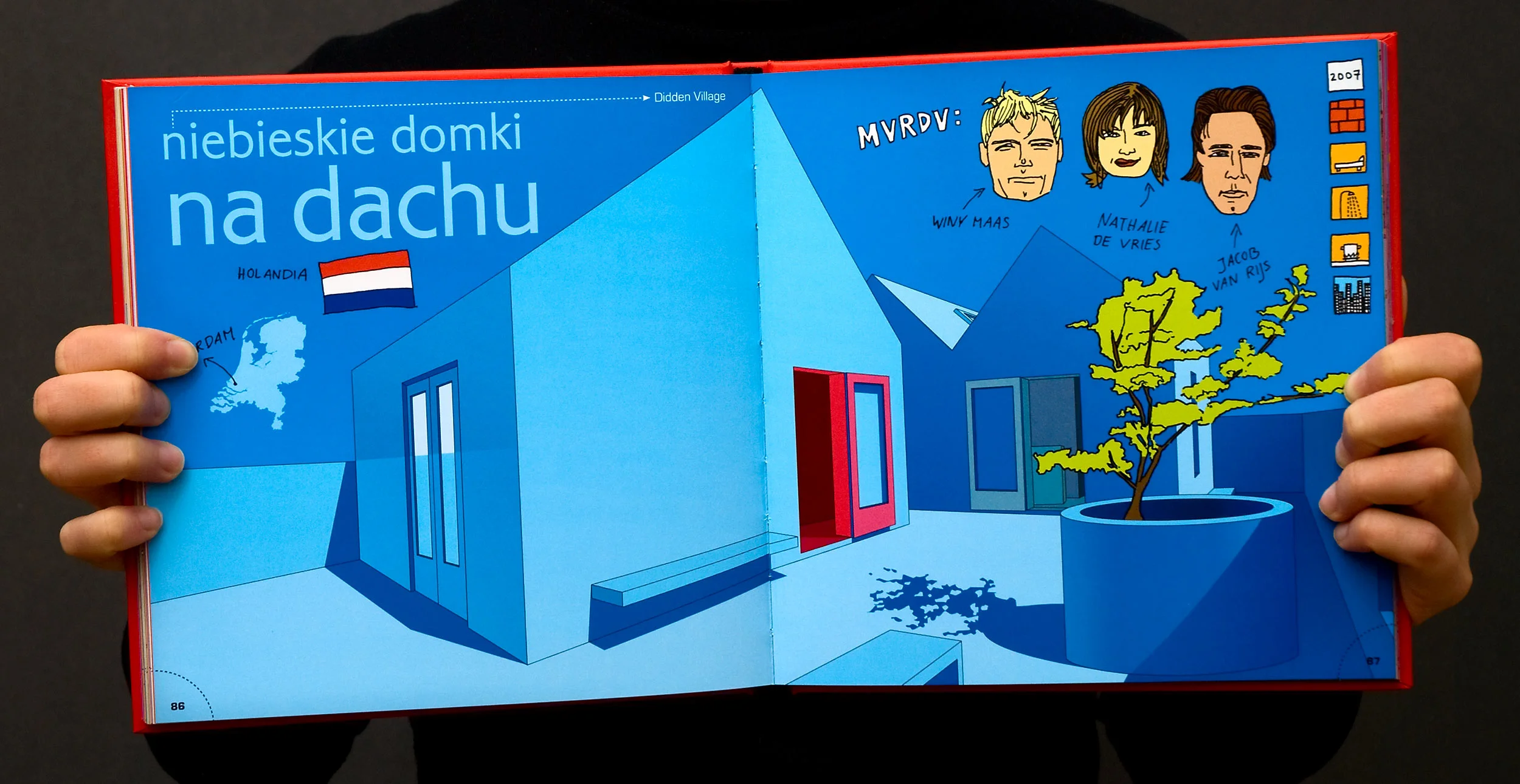
The icons on the right side of every first spread with new house came from our game design experience. In one glimpse they can tell when and where the house was build, what materials were used, which functions it can serve and if it uses solar energy or collects rainwater.
After the book was published we saw kids playing with icons by covering them and guessing all of the features just by looking at the illustration.
While working on this book we were also designing and coding Bubole and starting working on Pica-Pic, so we smuggled a lot of technics from games to books and vice versa. This was not new to us. Since our early projects we’ve been frequently using video game mechanics as an inspiration for printed projects. D.O.M.E.K. was just another testing ground where we could test new ideas and find modern ways for creating non-fiction picture books – a very neglected genre back in the beginning of two-thousands.
What’s going on with the title?
As you’ve probably figured out, the main title is an acronym and should be pronounced as a word (not a string of letters). The expansion was added after the title was chosen. The story behind it is simple. Polish word “domek” (little house) was our working title and we got used to it. It works and sounds good, so we kept it and just added dots between the letters to suggest that the book contains something more than just houses. Also, the idea of an acronym gave us a recognizability and a pattern for naming books in whole series.
D.O.M.E.K. making of
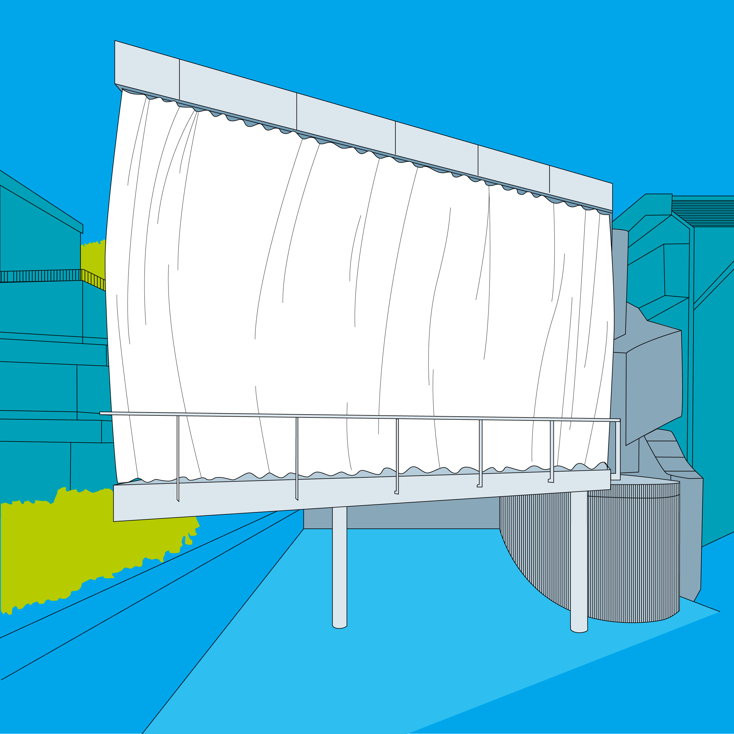
Each house in the book had 2 or 3 dedicated spreads and was drawn and written about from the beginning to the end by one of us. We started by making a precise, vector drawing of the building (we used Adobe Illustrator for that). Then we drew everything else on the paper using markers with a fine tip. Colors were added in Photoshop. All of the side notes were written by hand. We didn’t create a font for those side notes because back then we were not expecting any foreign editions. Selling books abroad wasn’t a thing any polish publisher was doing on a regular basis.


Co-edition
The typography in the original edition (only 2000 copies) was a little bit different. The titles and bold letters used to have color. This was changed after about a year, when we started working on the first foreign edition of the book. D.O.M.E.K. was the second book Dwie Siostry succeeded to sell abroad, so to make the offer more attractive we were asked to adapt the design to meet the needs of co-edition.
This was a new concept for us but the idea is simple. Color books are printed using 4 colors: Cyan, Magenta, Yellow, Black (CMYK). If the elements that need to be changed for another language version are colorful, then you need to change every offset plate to print new version. But if all of the texts are printed using one color, then you can use the same four CMYK plates for illustrations in every language version and just add fifth color (usually another black but it can be any Pantone color) for the texts. Only the additional plate would have to be changed for every sheet of paper.
This way one can combine a few foreign editions under single print order. Instead of printing 3000 copies of Polish edition solely, you can print 20000 copies of Polish, German, French, Italian and English editions because the majority of the printing plates will be exactly the same. This lowers the cost of producing a single copy and makes a book slightly more profitable.


Covers in general don’t follow any co-edition rules. The cost benefit is too low and colorful typography is very often a key component of a good cover design. Without this restrain foreign publishers sometimes want to change the cover. We never want to do that and in most cases we don’t have to. But D.O.M.E.K. was our first book and we didn’t have much to say about it. Moreover, it’s a common practice to change the cover when you buy rights to a title.
We hate that practice. It’s always a change for the worse.
Building a H.O.U.S.E.
One last thing worth mentioning are the workshops. We don’t do a lot of workshops, but in 2008 it was another novelty for us. We had this one scenario in which we introduced the concept of the book to the children. After that, we asked the children to build together the first base on Mars. Each child was assigned to decorate a single module of a structure we would build together. As tools we used carton boxes and lots of adhesive foil. The idea was to build something big. Something that you could walk into or at least walk through. Children enjoyed very much that most of the time adults could not fit into the final construction. Unfortunately we don’t have many photos from D.O.M.E.K. workshops.


Foreign editions
Chinese Simplified, 住宅之书, Tsinghua University Press, 2017, ISBN: 978-7-302-48481-3
Japanese, ハ.ウ.ス., Graphic-Sha Publishing Co., 2017, ISBN: 978-4-7661-2984-7
Korean, 생각하는 건축, Pulbit Publishing Co., 2015, ISBN: 978-89-7474-486-1
Czech, D.O.M.E.K., Jana Kosteleckà, 2014, ISBN: 978-5-91759-272-5
Russian, Д.О.М.А., Самокат, 2014, ISBN: 978-5-91759-272-5
Arabic, بيت, Kalima Project – Abu Dhabi Tourism and Culture Authority, 2013, ISBN: 978-9948-01-993-0
French, M.A.I.S.O.N., Mila Éditions, 2013, ISBN: 978-2-84006-765-8
Lithuanian, N.A.M.U.K.A.S., Modernaus Meno Centras, 2013, ISBN: 978-609-95406-1-0
Spanish, CASAS, Coco Books, 2013, ISBN: 978-84-940032-8-8
Chinese Traditional, 全世界最奇妙的房子, Prophet Press, 2012, ISBN: 978-986-134-193-4
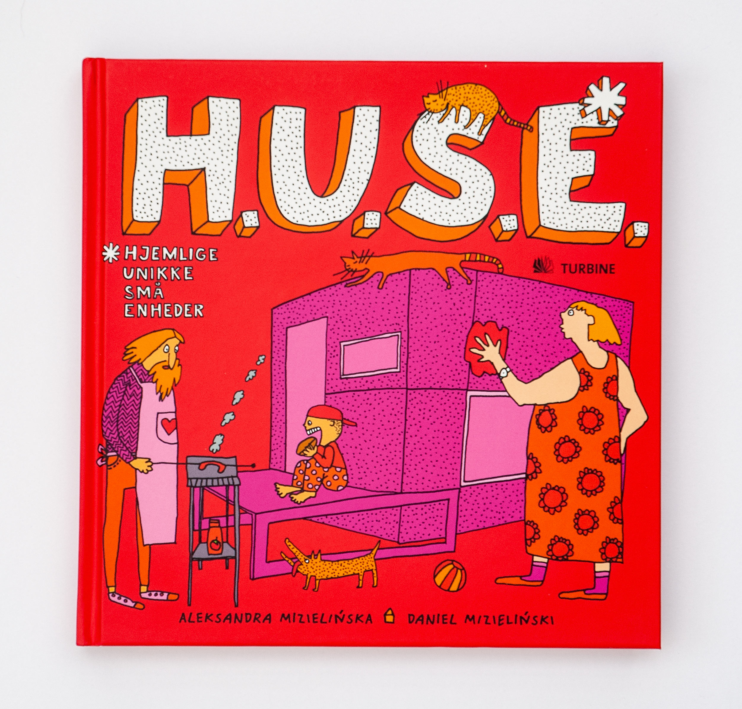
Danish, H.U.S.E., Turbine, 2012, ISBN: 978-87-7090-966-2
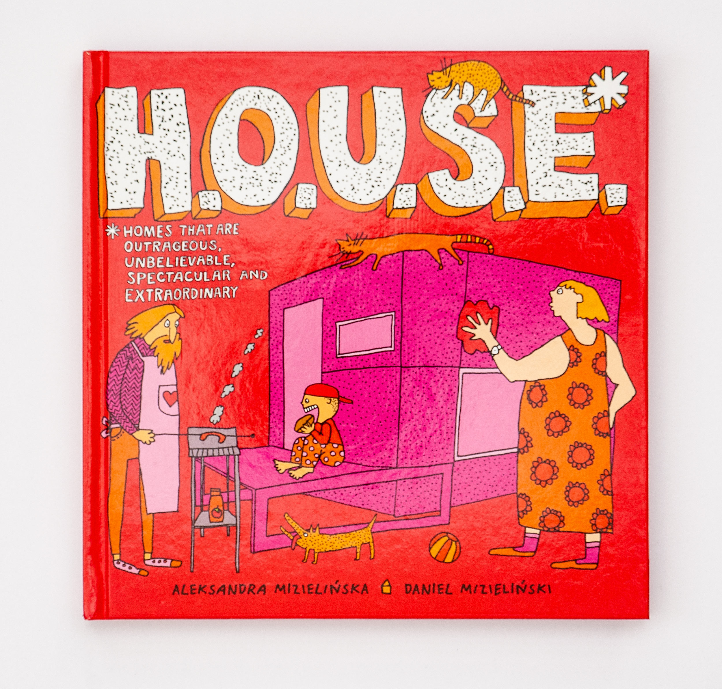
English (US), H.O.U.S.E., Harper Collins Publishers, 2012, ISBN: 978-0-06-211375-7
Dutch, Hut Hok Huis, Clavis Books, 2010, ISBN: 978-90-448-1435-4
English (NZ, GB), H.O.U.S.E., Gecko Press, 2010, ISBN: 978-1-87746-766-0
German, Treppe Fenster Klo, Büchergilde Gutenberg, 2010, ISBN: 978-3-7632-6375-2
German, Treppe Fenster Klo, Moritz Verlag, 2010, ISBN: 978-3-89565-217-2
Italian, C.A.S.E., Comma 22, 2009, ISBN: 978-88-88960-75-3
You can find a Google Sheet with a list of all our foreign editions here.


New edition
In 2022 Dwie Siostry Publishing House decided to print a new edition of the book. Although it was available continuously since 2008 a new version would bring it to the front on bookstore windows.
A new version is smaller and has a paperback cover. It was printed alongside D.E.S.I.G.N. and A.R.T..
